Infographic + Interactive design
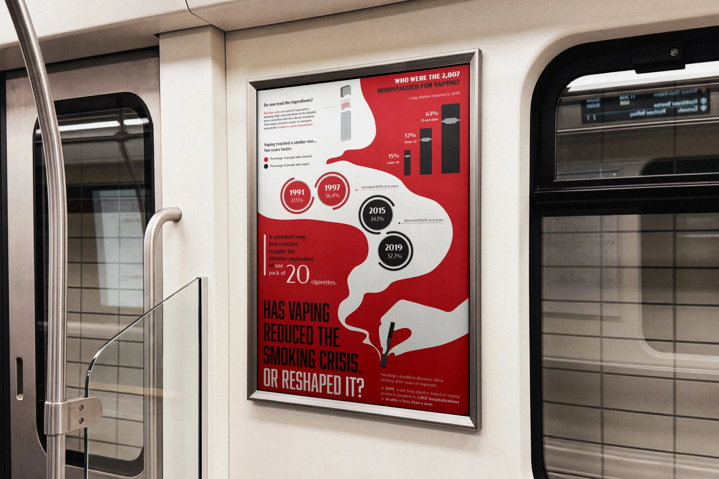
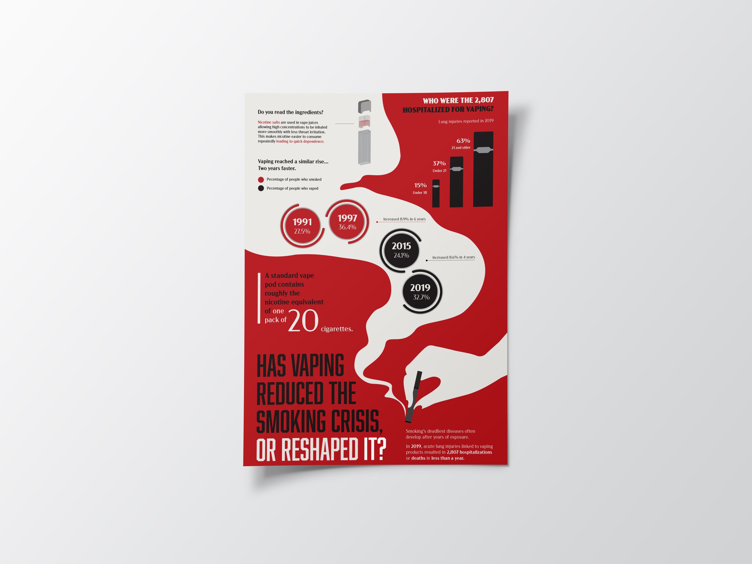
This project explored how research, data, and visual communication can transform complex information into an engaging design experience. I began by researching statistics on a selected topic and translating the findings into a 24 x 36 inch infographic poster using charts, diagrams, typography, and other graphic elements. I then adapted the static poster into a horizontal interactive experience in Figma, using movement, transitions, and user interaction to create a new way of presenting the information. This process challenged me to consider how a design can evolve across formats while still maintaining clarity, hierarchy, and visual consistency.
Research topic:
Has vaping reduced the smoking crisis, or reshaped it?
I chose this topic because I was in high school during the peak of e-cigarette use which made me think deeper into the root of the issue of how nicotine use today persists in a more discreet, flavored, and accessible form. It is known that vaping was created to help heavy smokers quit, but I think it has been just as, if not more addicting than cigarettes.
poster Wireframe concept
I used negative space to create a flowing, smoke-like path that organizes the information while reinforcing the poster’s theme. This approach gives each graphic element room to breathe and keeps the dense statistical content from feeling overwhelming.

color palette
Hex# a9312e
Hex# 221f20
Hex# e5e3e0
Hex# ffffff
Translating Statistics into Visual Information
Comparing Smoking and Vaping Trends
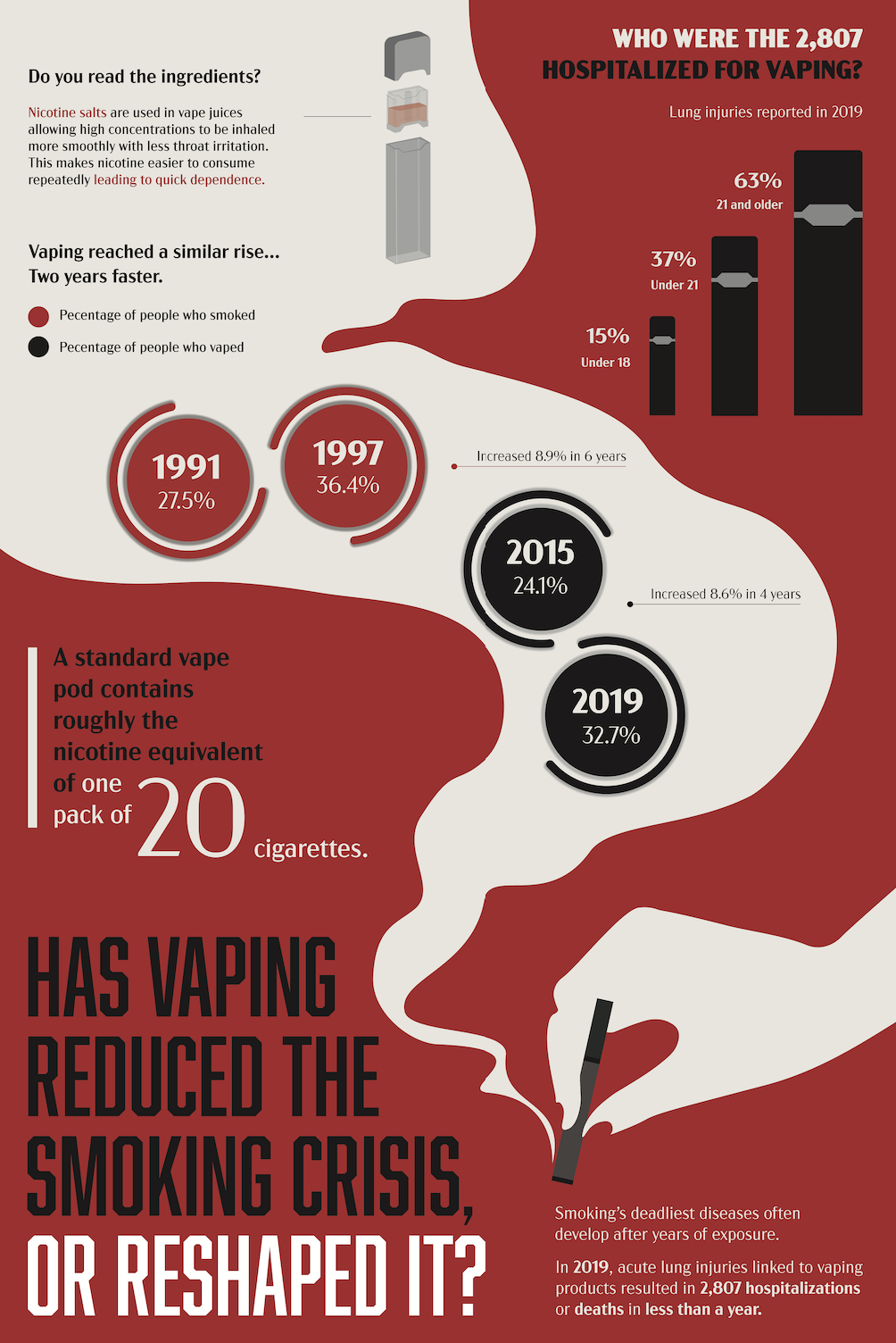
The circular graphics compare the rise of smoking and vaping across key years, showing how e-cigarette use reached a similar rise, but two years faster. Red represents smoking, while black represents vaping, creating a consistent visual distinction between the two trends.
Visualizing Hospitalization Data
“Who were the 2,807 hospitalized for vaping” communicates the ages of people hospitalized for vaping-related lung injuries in 2019. Each bar represents a different age group, with the increasing heights drawing attention to the percentage of cases among users.
Showing Nicotine Equivalency
To make the amount of nicotine in a vape pod more understandable, I compared it to the nicotine equivalent of a pack of cigarettes. Enlarging the number “20” creates an immediate focal point and gives the viewer a relatable point of reference. This graphic turns an unfamiliar measurement into a more tangible comparison.
Supporting Information with Illustration
The “Do you read the ingredients” diagram provides additional context for the statistics presented throughout the poster. The ingredient section explains how nicotine salts allow higher concentrations of nicotine to be inhaled more smoothly, while the illustrated vape pod reinforces the product being discussed. These elements combine educational information with visual representation to make the research more engaging and accessible.
Mockups