intel sustainability timeline:
Designing for a global audience
Localization • Accessibility • Responsive Design
Intel is committed to building a more sustainable future and needed an engaging way to communicate its sustainability journey. The objective was to redesign an interactive timeline that could effectively showcase Intel's sustainability goals while improving accessibility, responsiveness, and localization for a global audience.
Project overview
timeline
2 weeks
tools
HTML • CSS • JavaScript • Bootstrap • GitHub Copilot
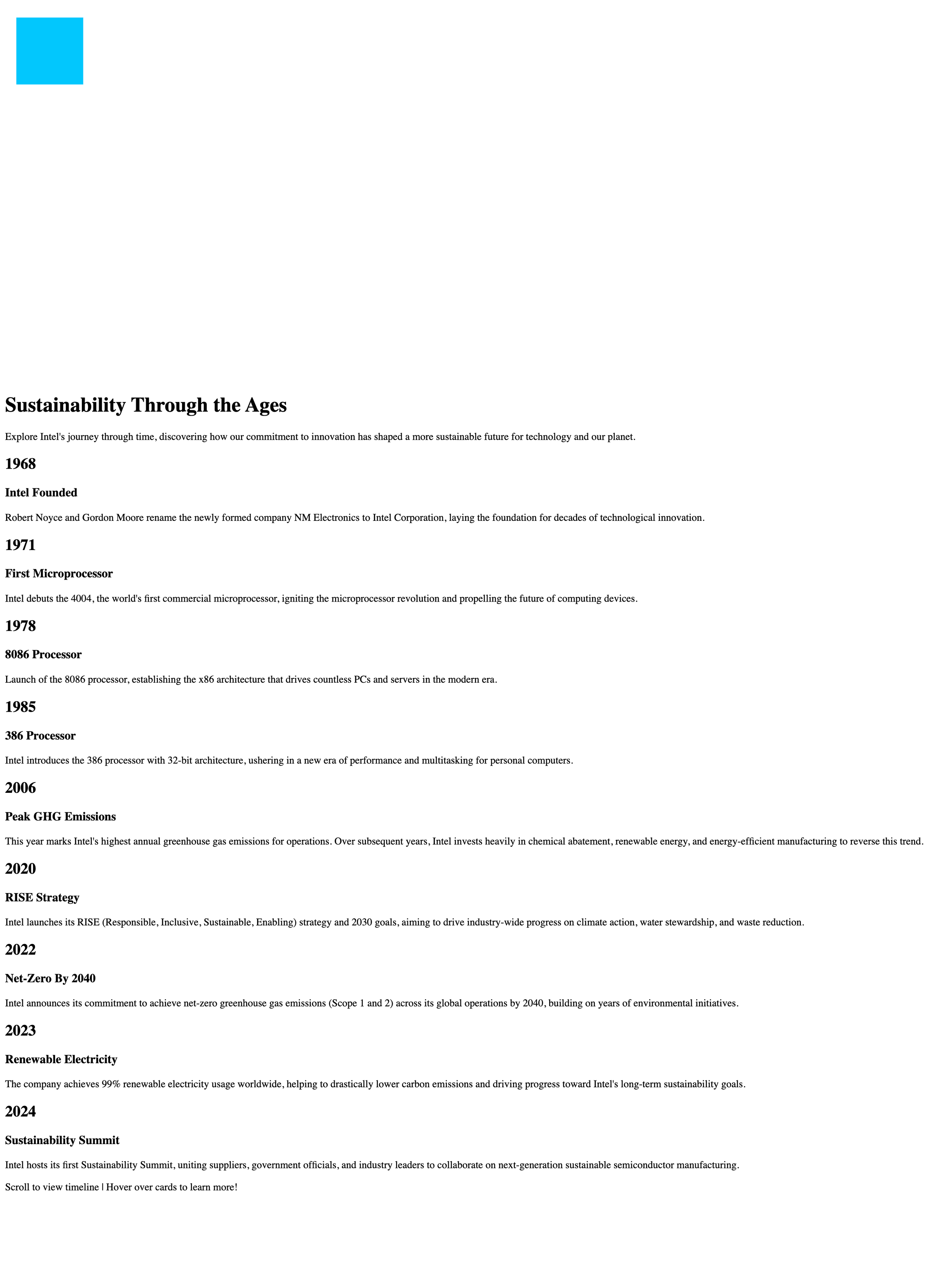
The starting point
Original experience — The initial GitHub page provided the timeline content and chronological structure that became the foundation for the redesign.
The original experience presented Intel’s sustainability milestones as a simple, vertically stacked timeline. While the core content was already there, the page relied almost entirely on text, making it difficult to quickly scan milestones, understand the progression over time, or feel engaged with the story.
I began by evaluating how the existing content could be transformed into a more intuitive and visually engaging experience, while preserving the information and chronological narrative provided in the original site.
Several key opportunities emerged from this evaluation:
Visual hierarchy: Years, milestones, and descriptions had limited visual differentiation, making the timeline feel more like a document than an interactive experience.
Timeline navigation: Although the content followed a chronological order, the vertical layout did little to visually communicate the passage of time or encourage exploration.
Visual storytelling: The experience relied almost entirely on text. Introducing imagery, cards, color, and interactive states created an opportunity to give each milestone its own identity and make Intel’s sustainability journey more memorable.
Responsive design: The experience needed to adapt intentionally across desktop and mobile rather than simply shrinking the desktop layout.
Interaction & engagement: The original experience offered limited interaction beyond scrolling. A key opportunity was to turn the timeline into something users could actively explore rather than passively read.
Accessibility and readability: Contrast, text sizing, spacing, and content organization needed to support a clearer and more comfortable reading experience.
designing for a global audience
Designing for a global audience means creating an experience that remains intuitive and accessible across different languages and cultural contexts. For the Intel timeline, I adapted the interface to support both left-to-right (LTR) and right-to-left (RTL) languages, ensuring that navigation, content hierarchy, and interactions remained consistent as the layout changed direction. This reinforced the importance of treating localization as part of the design process. Not simply translating content, but designing an experience that works for users around the world.
-
Traditional web layouts assume users read left to right.
Intel's sustainability story needed to be accessible to users beyond English-speaking audiences. Supporting multiple languages required more than translating text. The interface itself needed to adapt to different reading directions while remaining intuitive across devices.
-
Design an engaging timeline that communicates Intel's sustainability journey.
Adapt the experience for both left-to-right (LTR) and right-to-left (RTL) languages.
Improve accessibility through responsive layouts and inclusive design practices.
Integrate Bootstrap to create a consistent experience across desktop and mobile devices.
-
Reviewed Intel's sustainability initiatives.
Identified key milestones for the timeline.
Considered how users would navigate information on desktop versus mobile.
Explored how localization affects layout, readability, and interaction.
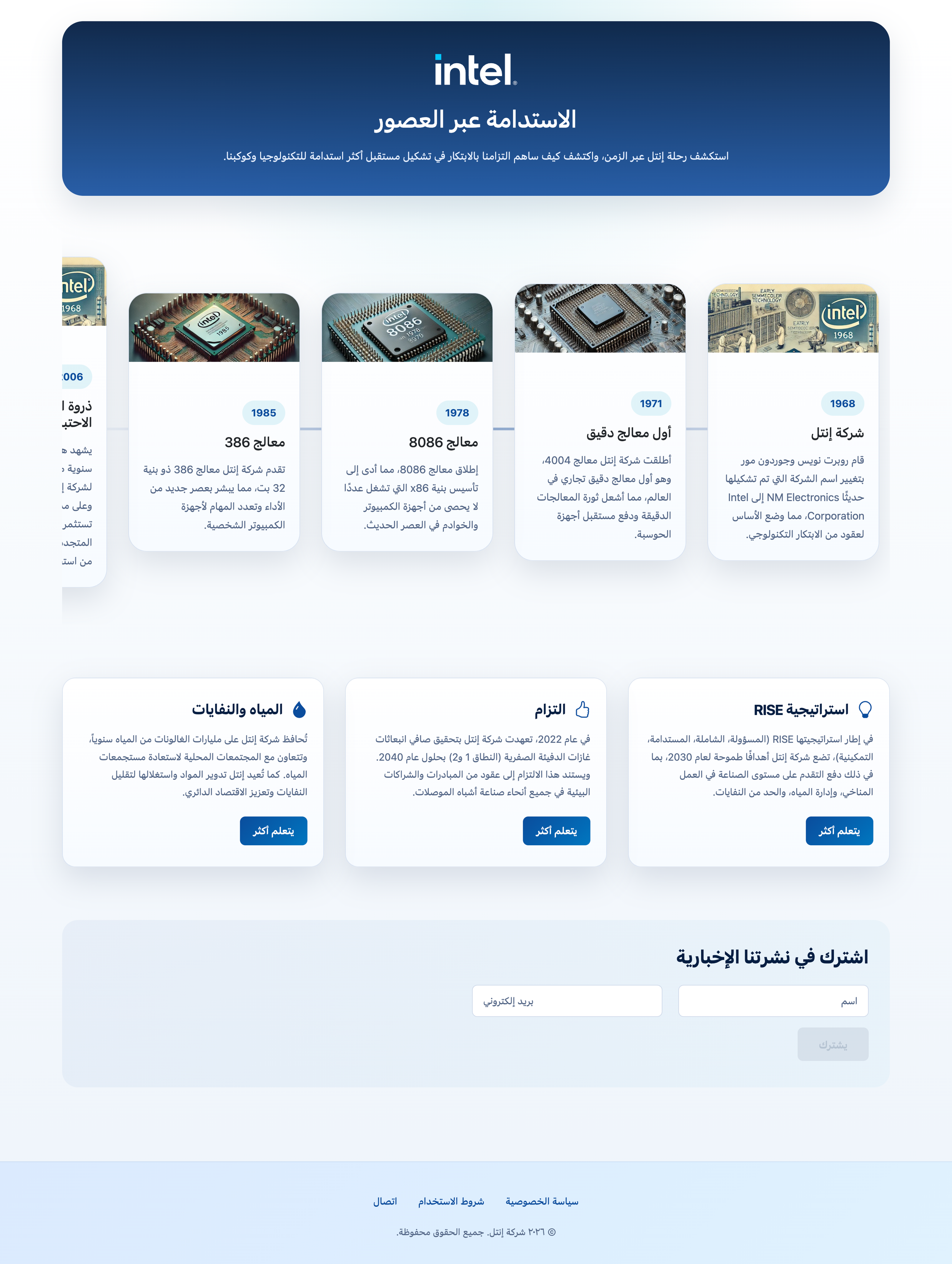
Left-to-right (LTR) language
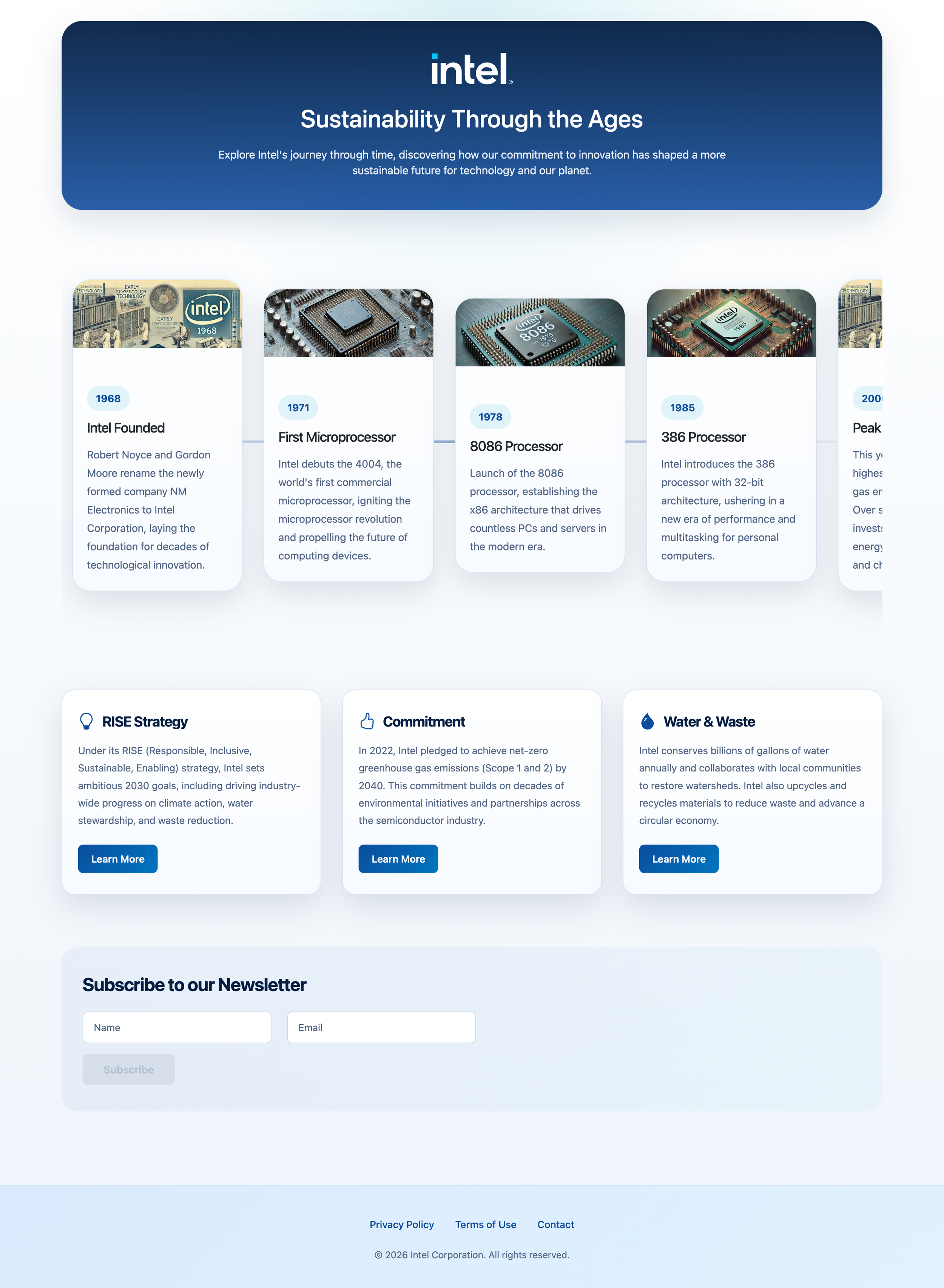
Right-to-left (RTL) language
responsive design
Desktop interactions were redesigned for mobile users by adapting layouts and improving usability on smaller screens.
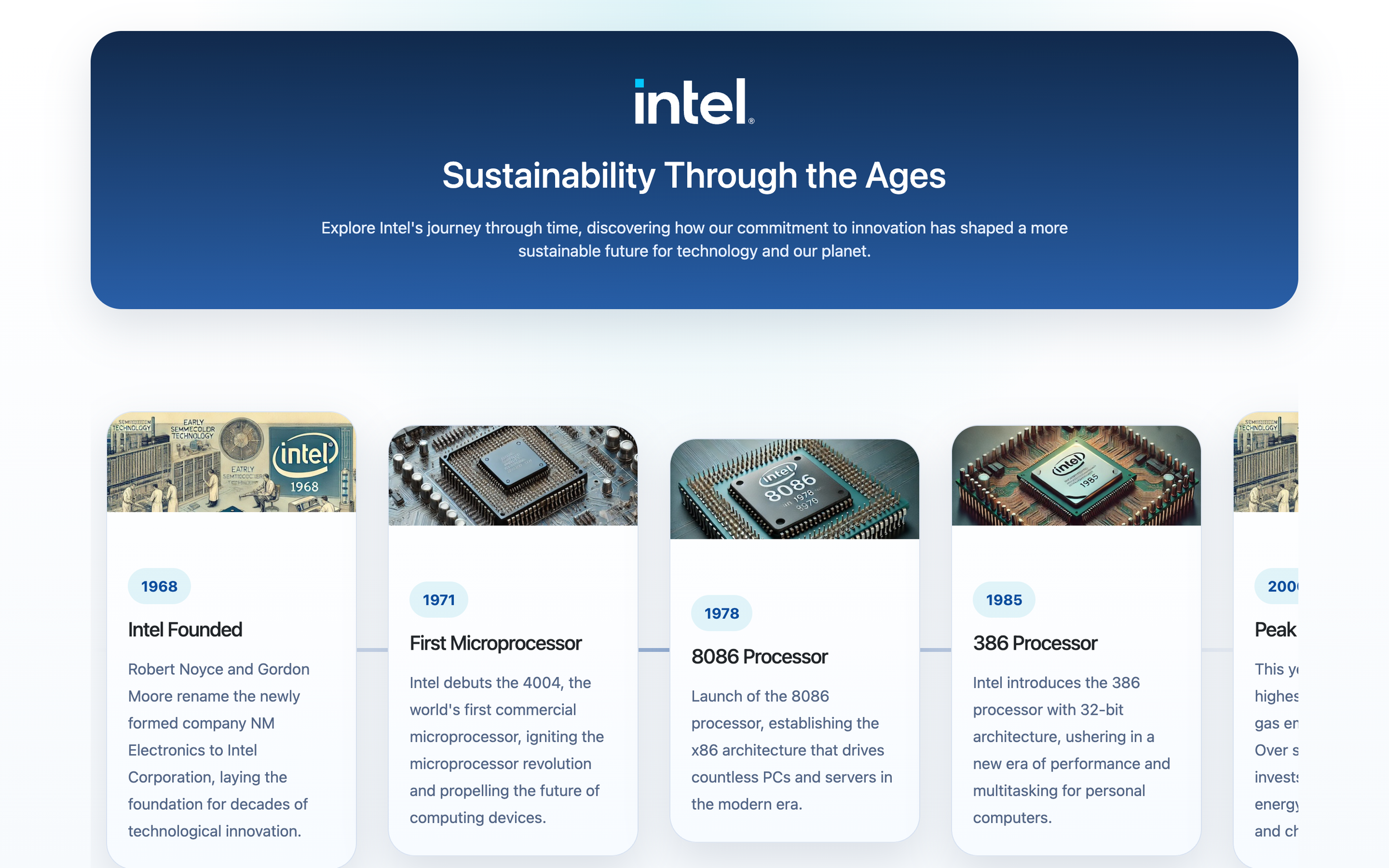
desktop
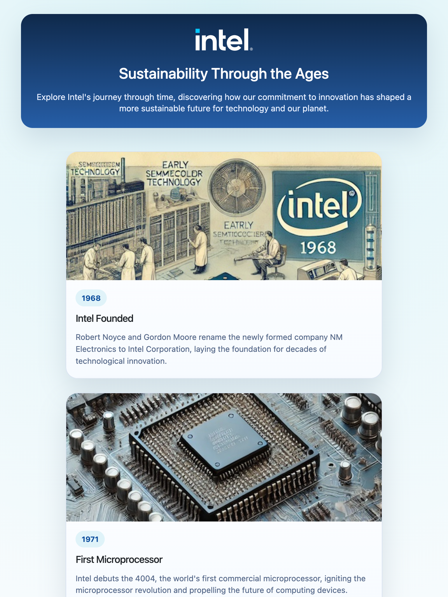
tablet
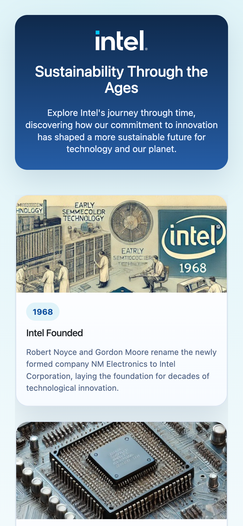
mobile
implementation
Bootstrap was integrated to improve responsiveness, while HTML, CSS, and JavaScript were used to implement localization and accessibility features. JavaScript dynamically adapted the layout when users translated the page into right-to-left languages.
reflection
One of the biggest takeaways from this project was realizing that localization goes beyond translating text. Supporting a global audience means considering how different languages influence layout, navigation, and overall user experience. This project strengthened my understanding of responsive design, accessibility, and how thoughtful implementation can make digital experiences more inclusive.