nasa apod explorer:
Designing Dynamic Data Experiences
API Integration • User Experience • Interaction Design
project overview
NASA's Astronomy Picture of the Day contains thousands of incredible images and stories, but browsing that information isn't always intuitive. The goal was to design an interactive experience that allows users to explore NASA's imagery through a clean, engaging interface while making complex data easy to discover and understand.
timeline
1 Week
tools
HTML • CSS • JavaScript • NASA APOD API • GitHub Copilot
NASA provides an incredible amount of public information, but users need an intuitive way to browse and explore it. Rather than displaying raw API data, the experience needed to organize images, titles, dates, and descriptions into an interface that encouraged exploration while remaining easy to navigate.
the problem
-
Create an engaging way to explore NASA's Astronomy Picture of the Day.
Transform live API data into a visually organized gallery.
Improve discoverability through custom date selection.
Design an intuitive modal experience for viewing detailed information.
Maintain visual consistency with NASA's brand identity.
-
Before building the interface, I considered:
How should users browse hundreds of images?
What information is most important initially?
What should remain hidden until a user wants more detail?
How can loading states improve the experience?
The Starting Point
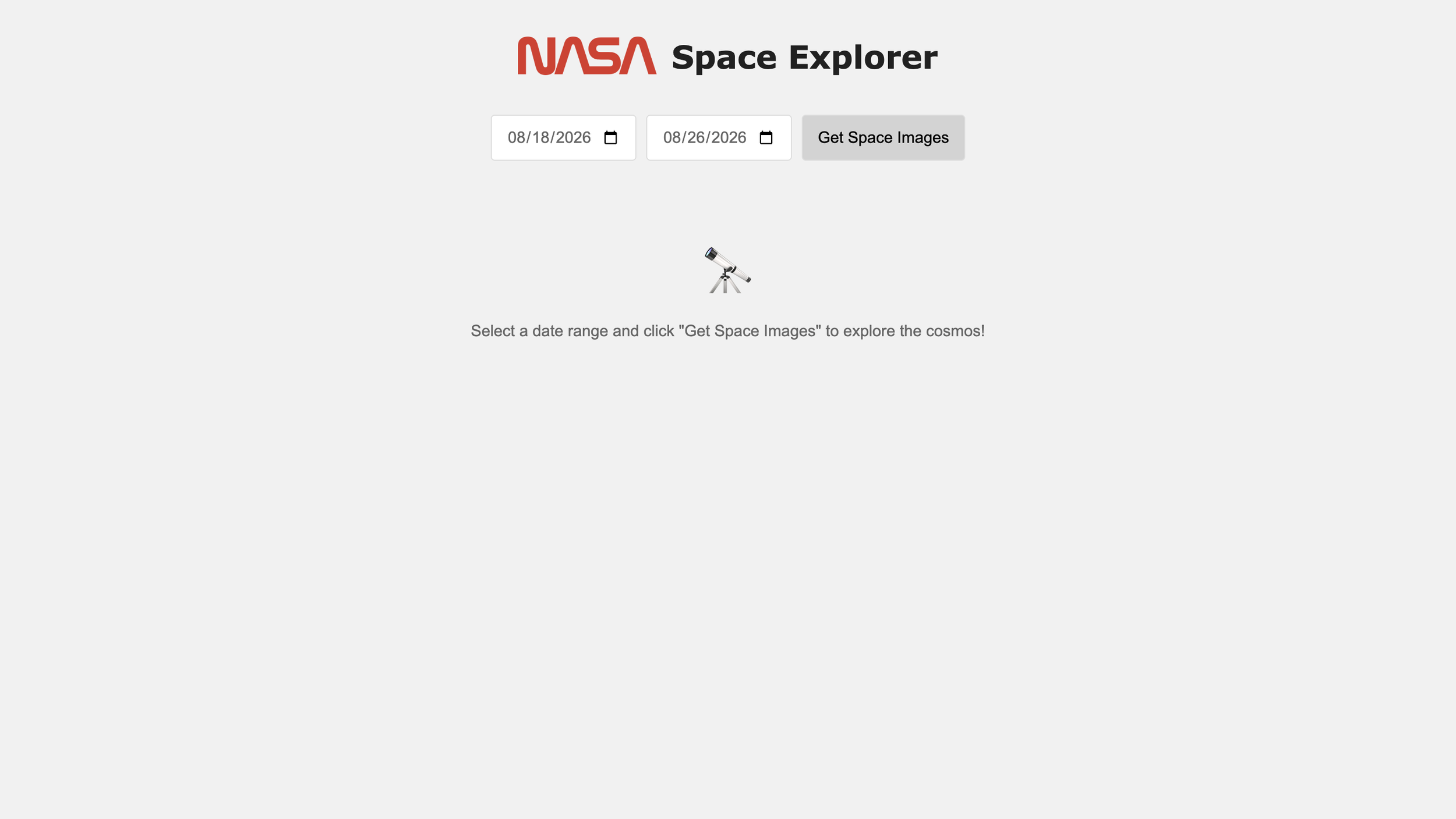
As part of the Global Career Accelerator Web Development track, I was provided with a starter Codespace that included the initial project structure. From there, I expanded the experience by designing the interface, integrating the NASA APOD API, and implementing the interactive features that brought the application to life.
This is the starter webpage before implementing NASA branding and connecting the "Get Space Images" button to the NASA APOD API. From this foundation, I transformed the template into an interactive application that dynamically retrieves and displays Astronomy Picture of the Day content based on the user's selected date range.
Existing Experience
Before beginning the redesign, I explored NASA's existing Astronomy Picture of the Day (APOD) website to better understand how users currently access the content. While the site provides an incredible archive of astronomy images and educational information, the experience relies heavily on text-based navigation and dense layouts that can make browsing feel overwhelming, especially for first-time users. This analysis helped me identify opportunities to improve discoverability, simplify navigation, and create a more visually engaging experience that encourages exploration while preserving NASA's educational content.
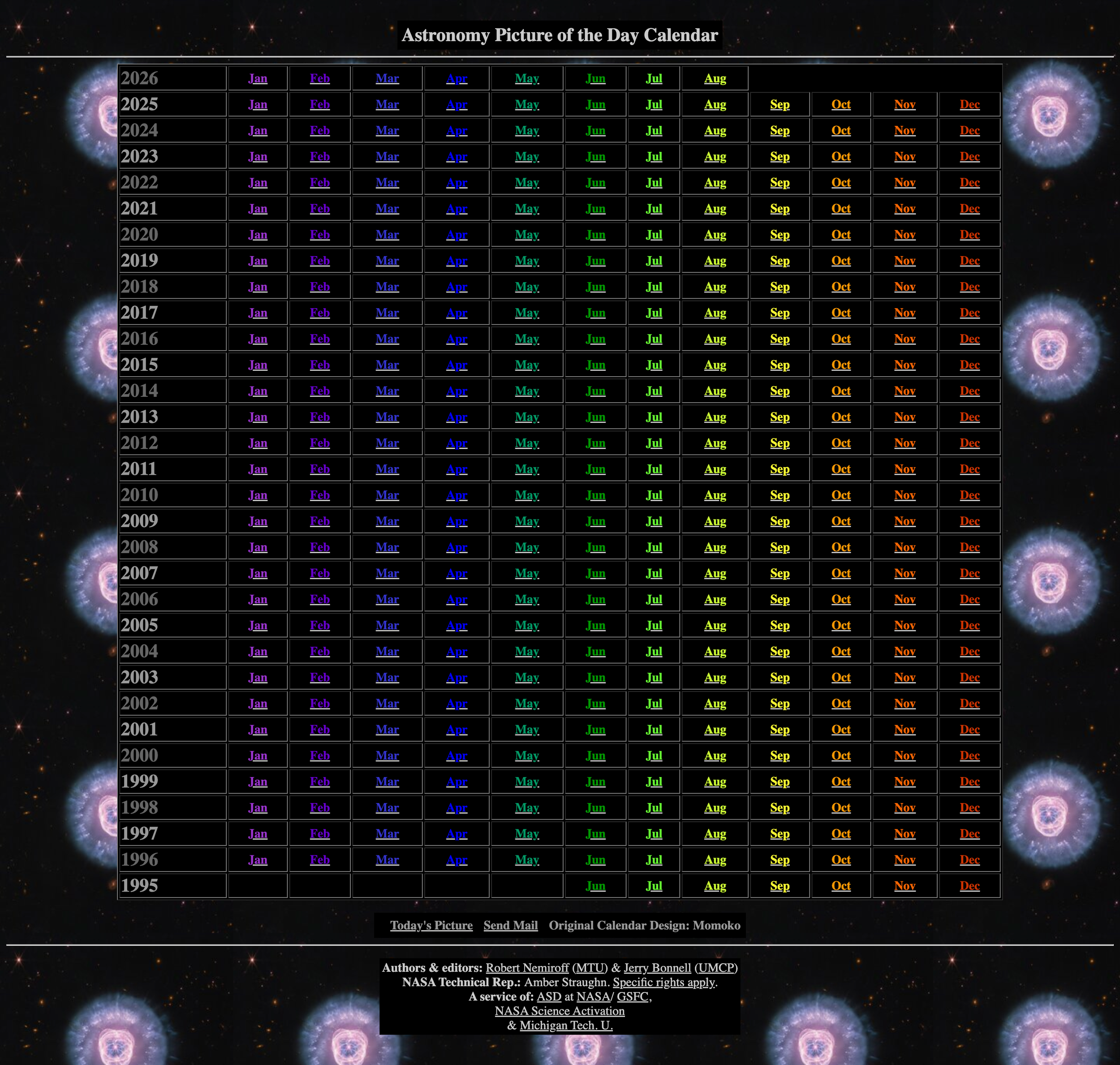
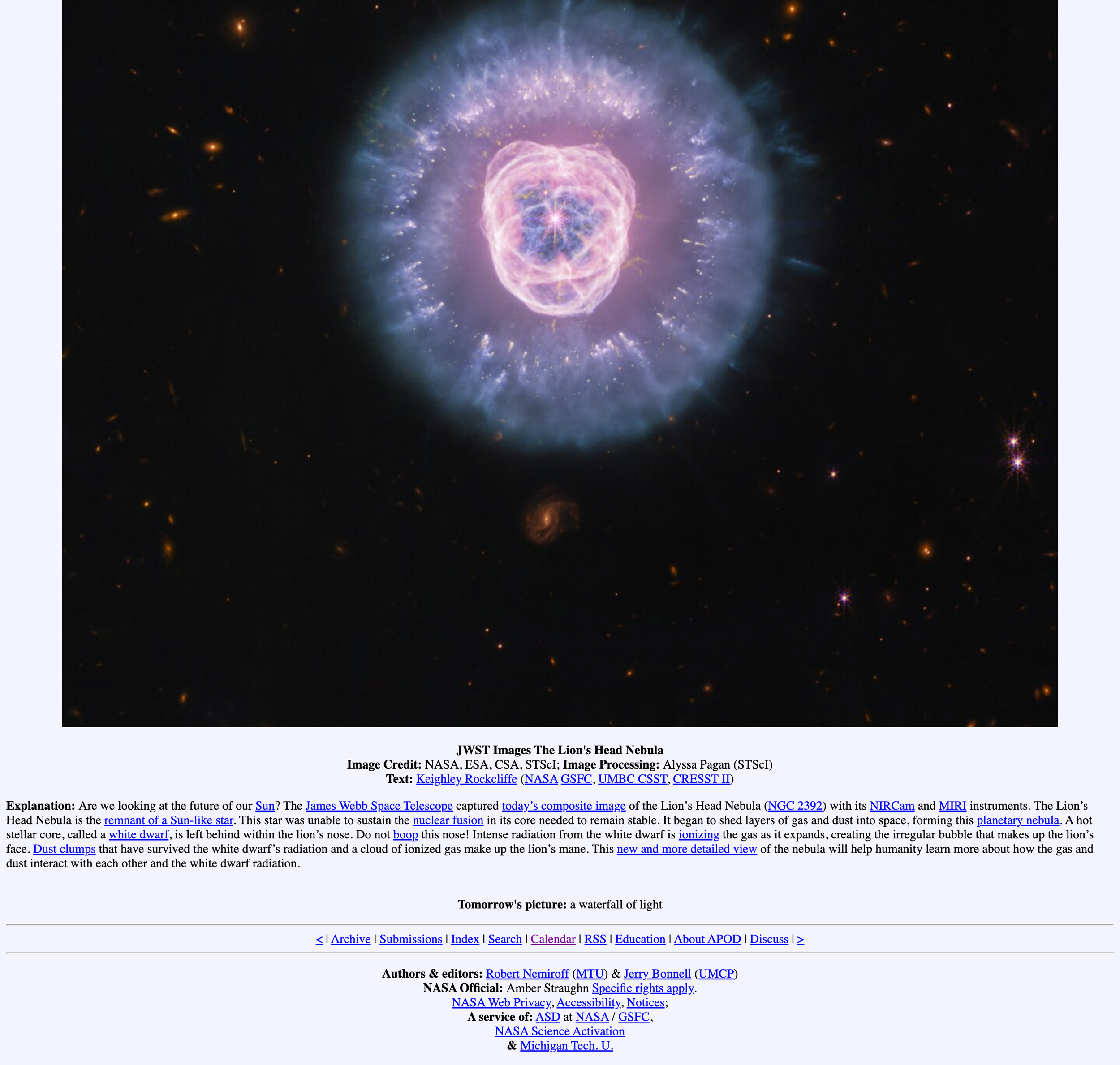
The existing calendar had room for accessibility improvements and could increase more engagement in a more organized way.
The existing image and information page had an opportunity to be displayed in a more modern way by using a modal experience.
information hierarchy
Designing the content hierarchy was crucial to let users discover information progressively rather than presenting everything at once. Each card prioritizes the most recognizable and scannable information first, while more detailed content is reserved for the modal experience.
Image
↓
Title
↓
Date
↓
Select a card
↓
Detailed explanation inside modal
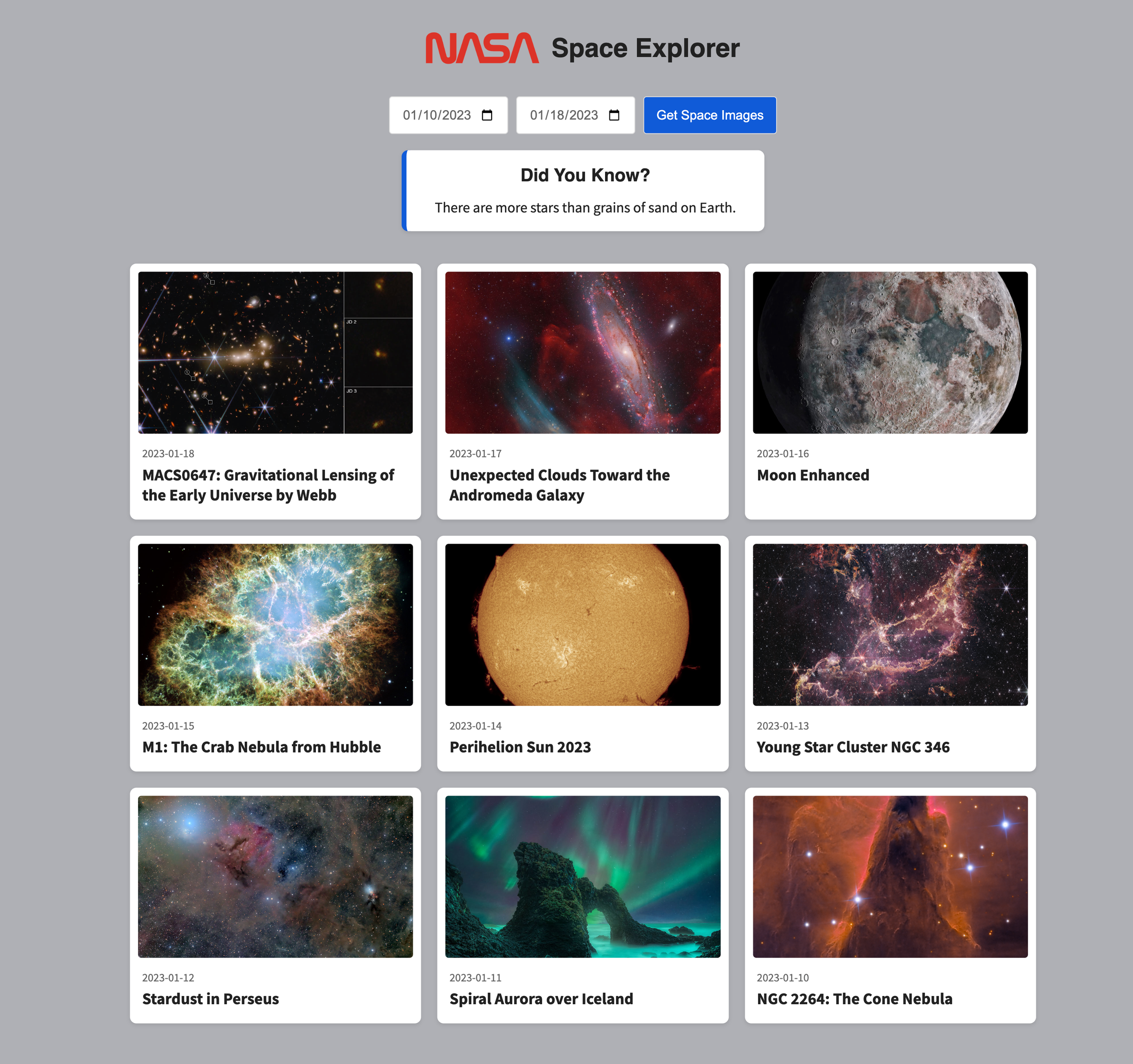
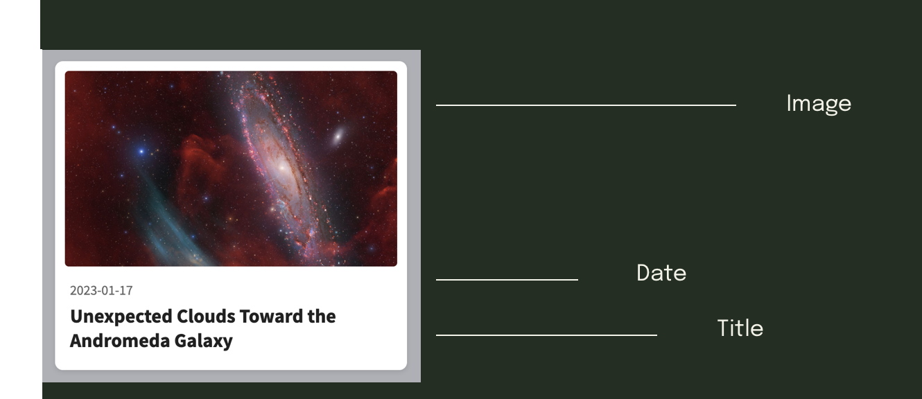
This approach creates progressive disclosure, allowing users to quickly scan and identify topics that interest them before choosing to learn more. Moving longer descriptions into modals also reduces visual clutter, keeps the main interface focused, and makes information-heavy NASA content feel more approachable and easier to explore.
modal experience
Instead of creating another page, a modal display was used to reduce unnecessary navigation, encourage continued exploration, and keep users in context.
technical implementation
An API (Application Programming Interface) allows different applications or systems to communicate and exchange data. In this project, the NASA APOD API connects the website to NASA’s database, allowing the interface to dynamically retrieve information such as astronomy images, titles, dates, and descriptions based on the user’s selected date range.
API
API Integration
-
The NASA APOD API retrieves live astronomy images, titles, dates, and descriptions based on the user's selected date range.
-
Integrating the NASA API transformed the application from a static gallery into a dynamic experience that updates in real time. Instead of manually curating content, users can explore different dates and instantly discover NASA's daily imagery. This creates a more engaging experience while encouraging repeat visits because the content continuously changes.
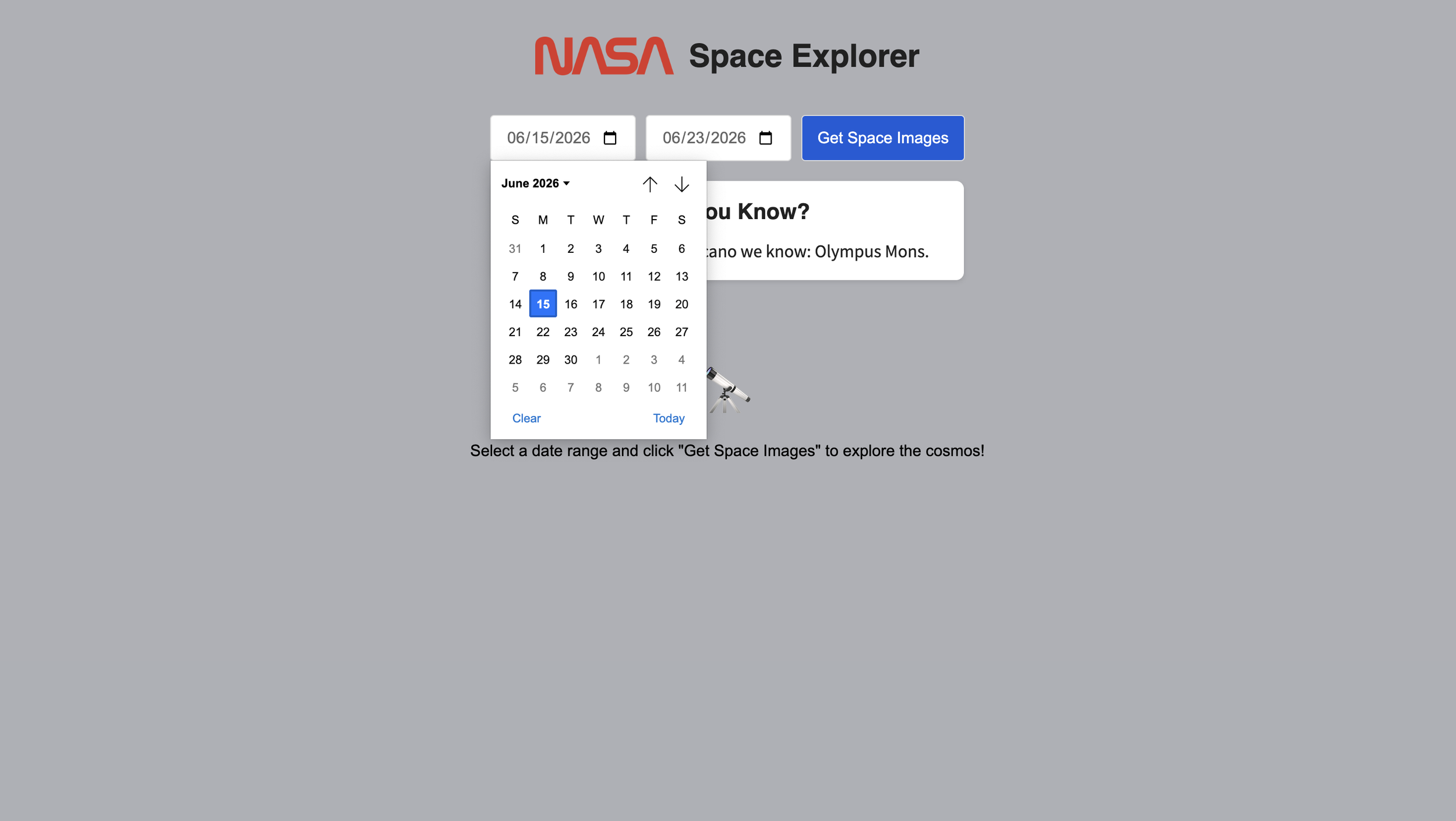
1 User selects date range
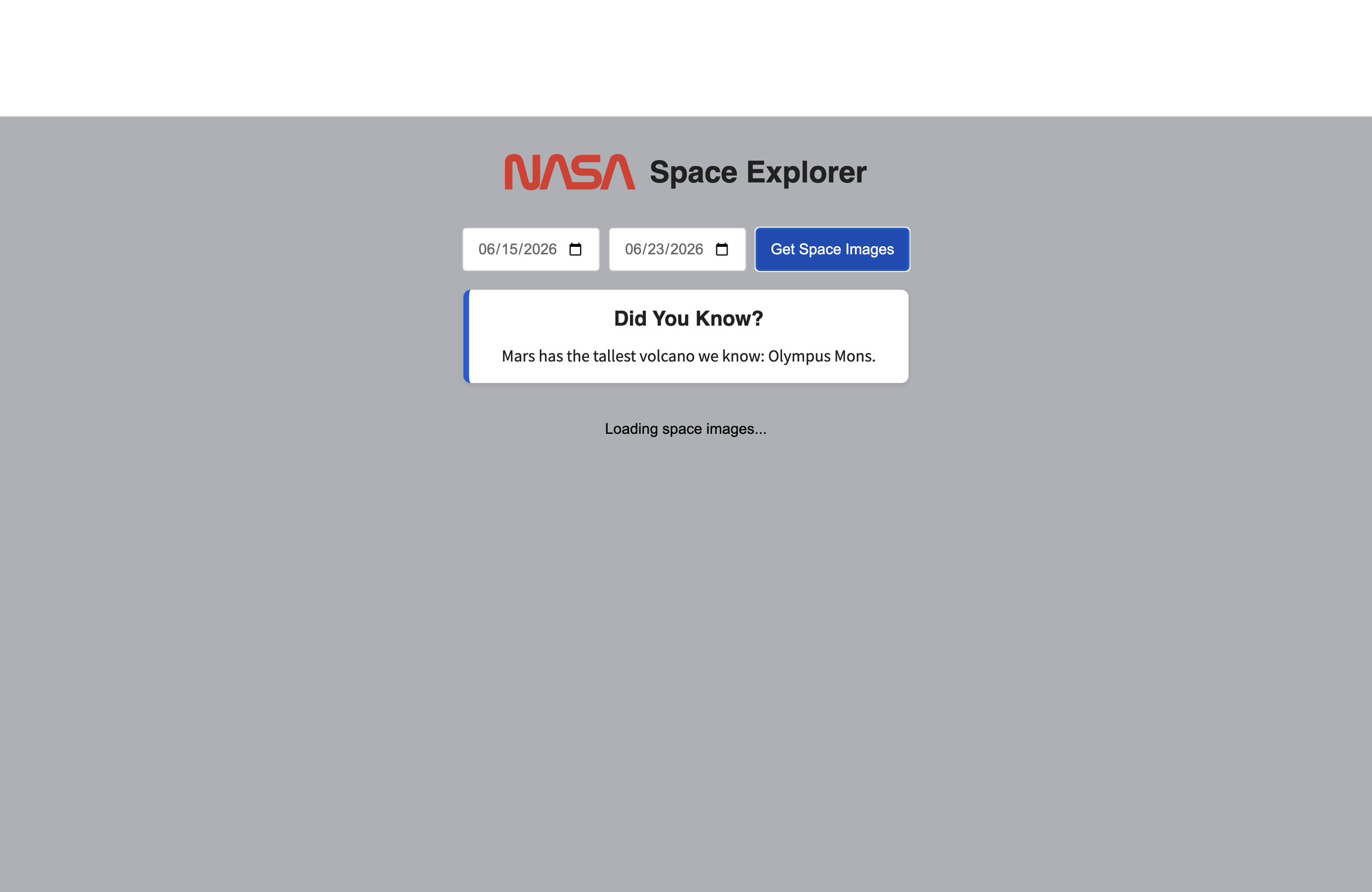
2 User hits ‘Get Space Images’ button
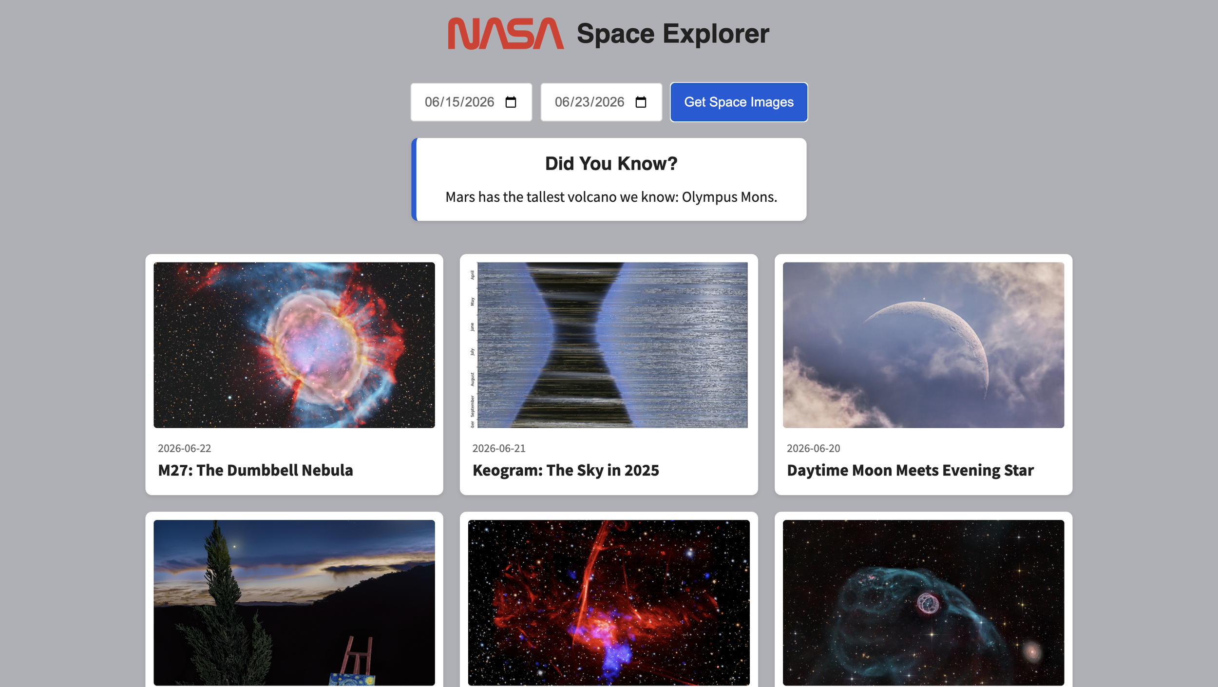
3 NASA APOD is retrieved by the NASA API and displays images, names, dates in an organized layout
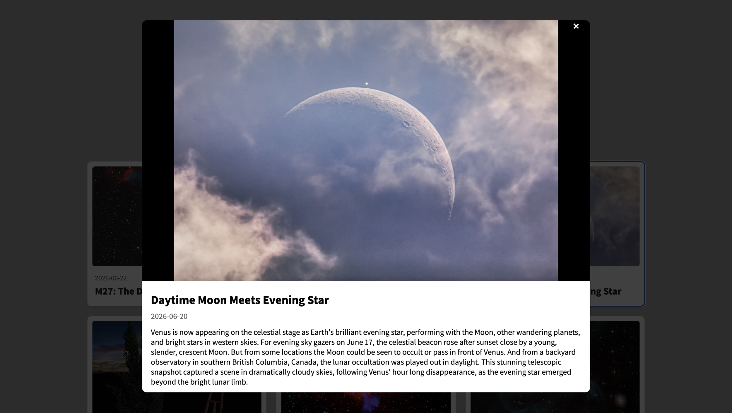
4 User clicks on a card and a modal display appears with more information
reflection
One of the biggest lessons from this project was learning how APIs influence user experience. While connecting to the NASA API was important, I realized that the real design challenge was deciding how information should be organized, displayed, and revealed. Features like progressive disclosure through the modal and thoughtful information hierarchy helped transform raw data into a more engaging experience. This project reinforced that successful UX design isn't just about presenting information, it's about helping users explore it naturally.