Retail App Design
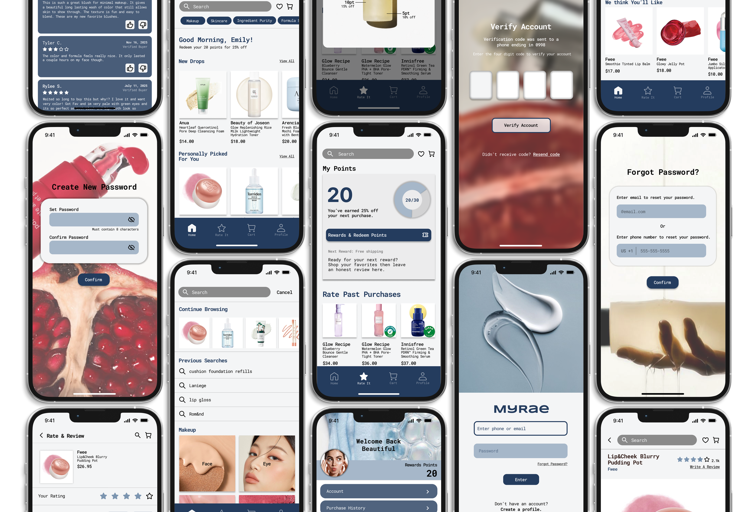
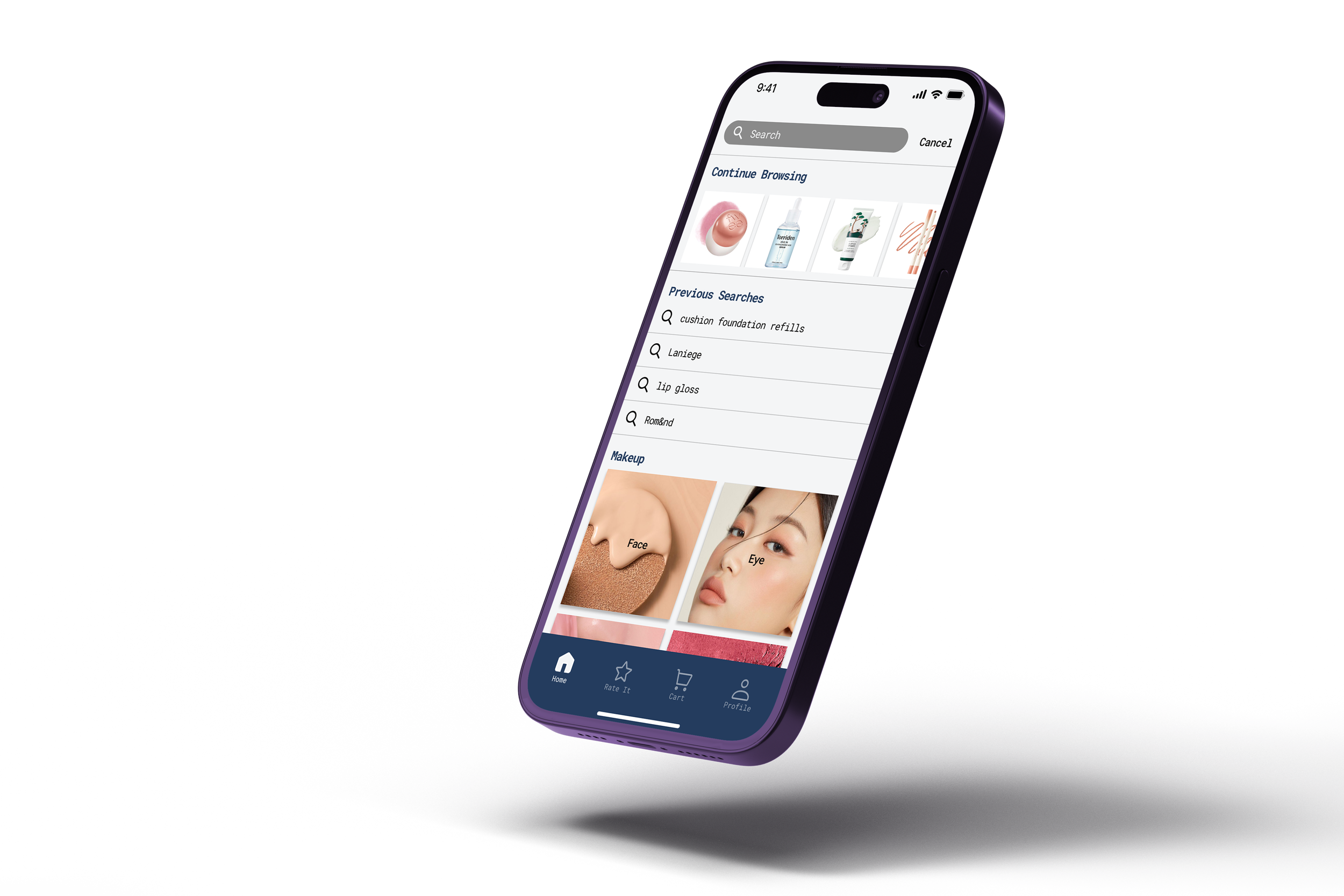
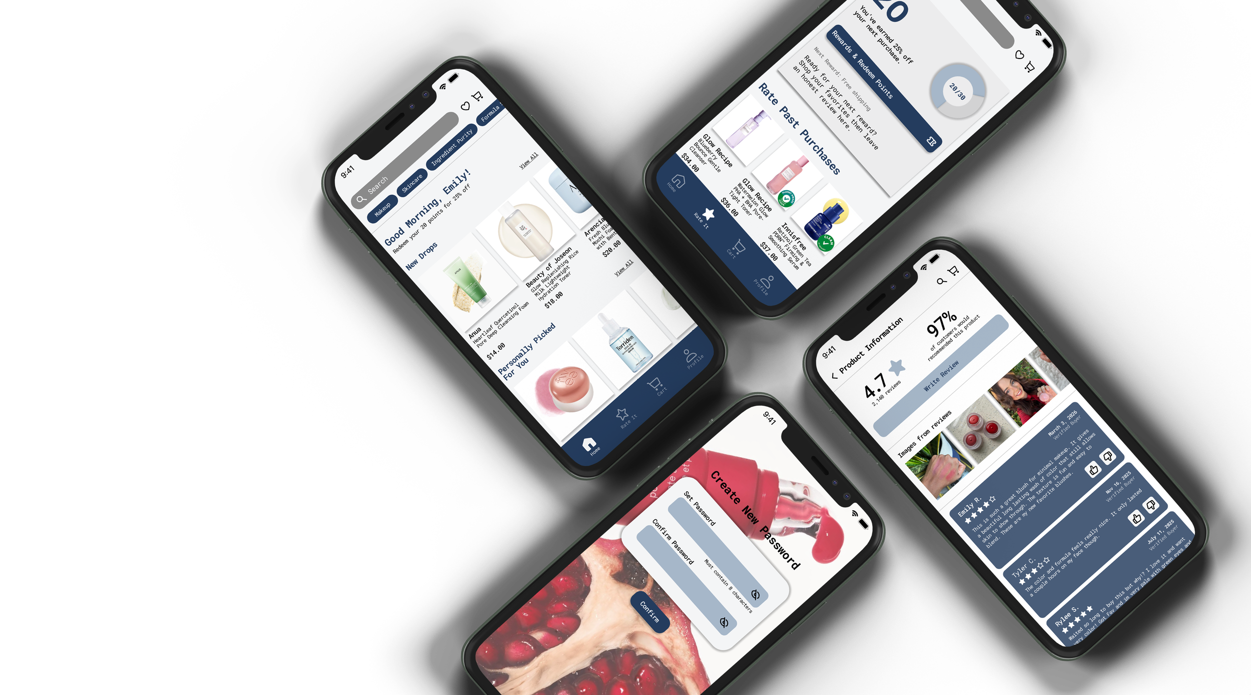
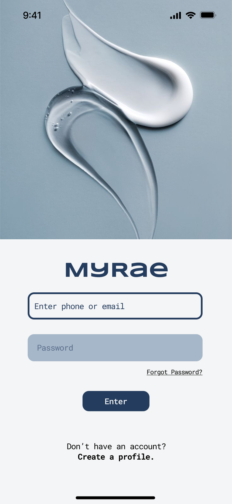
Shopping for makeup and skincare online can feel uncertain because customers cannot test a product’s shade, texture, quality, or compatibility with their skin through a screen. Product descriptions and unverified reviews can also be misleading, making it difficult to know which information to trust. Myrae is a clean beauty retail app designed to reduce this uncertainty through greater transparency and authentic customer feedback. Its “Rate It” feature allows only verified purchasers to leave reviews and rewards them with incentives, such as discounts, for sharing their real experiences. By combining trustworthy reviews with clear ingredient information, Myrae helps users feel more informed and confident before making a purchase. The app was designed entirely in Figma.
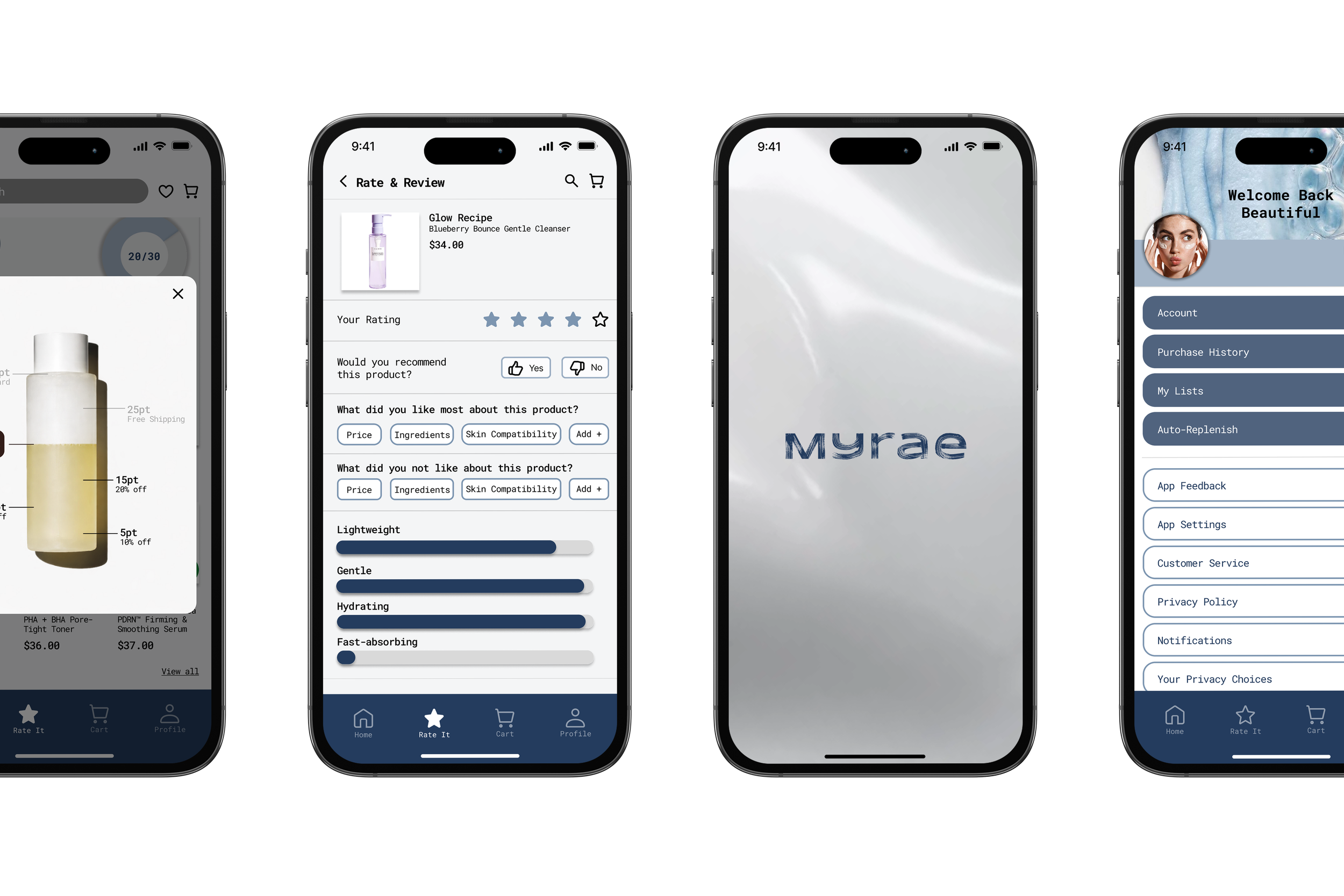
Designed by Michelle Wong and Tiffany Chen.
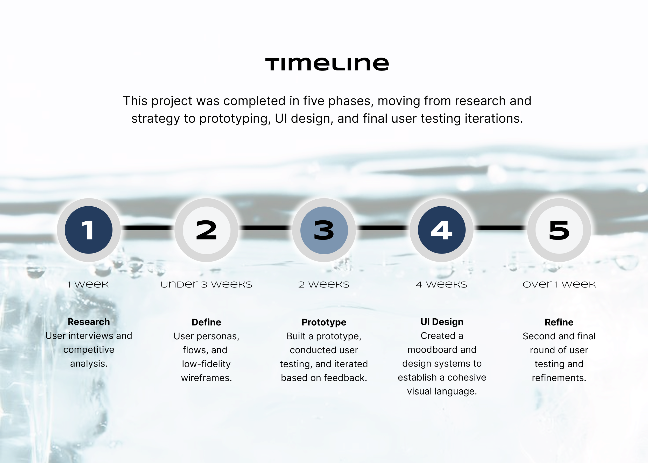
Phase 1:
Market and user research, competitive analysis, user flows, and value proposition
Research
Before beginning the design process, my partner and I conducted user interviews to uncover common pain points within an existing retail app. Hearing directly from users helped us understand which features supported their shopping experience, where frustration or uncertainty occurred, and what opportunities we could address through our design.
-
The user testing group consisted of participants aged 18–30, including both male and female users, who were either students or working full-time.
-
Application
AmazonType
Hybrid applicationObjective
Explore and purchase products across multiple brandsTone / Mission
Seamless, trustworthy shopping experienceKey Features
Product search, purchasing, personalized recommendations, customer reviewsStrengths
Accurate products, fast shipping, strong customer support, reliable reviewsWeaknesses
Cluttered interface, overwhelming product listings, inconsistent third-party sellers, mobile usability issuesTarget Users
Broad audience; primarily Millennials and Gen Z focused on convenience and personalizationUser Interface
Simple and consistent structure, but heavily information-dense at times -
User interviews revealed that many participants found existing retail apps overwhelming, citing cluttered interfaces, too many product options, and difficulty trusting reviews. In response, our value proposition focuses on creating a more streamlined and trustworthy experience through verified user-generated ratings, clear ingredient transparency, and curated product selections. This approach reduces decision fatigue and helps users feel more confident in their purchasing decisions.
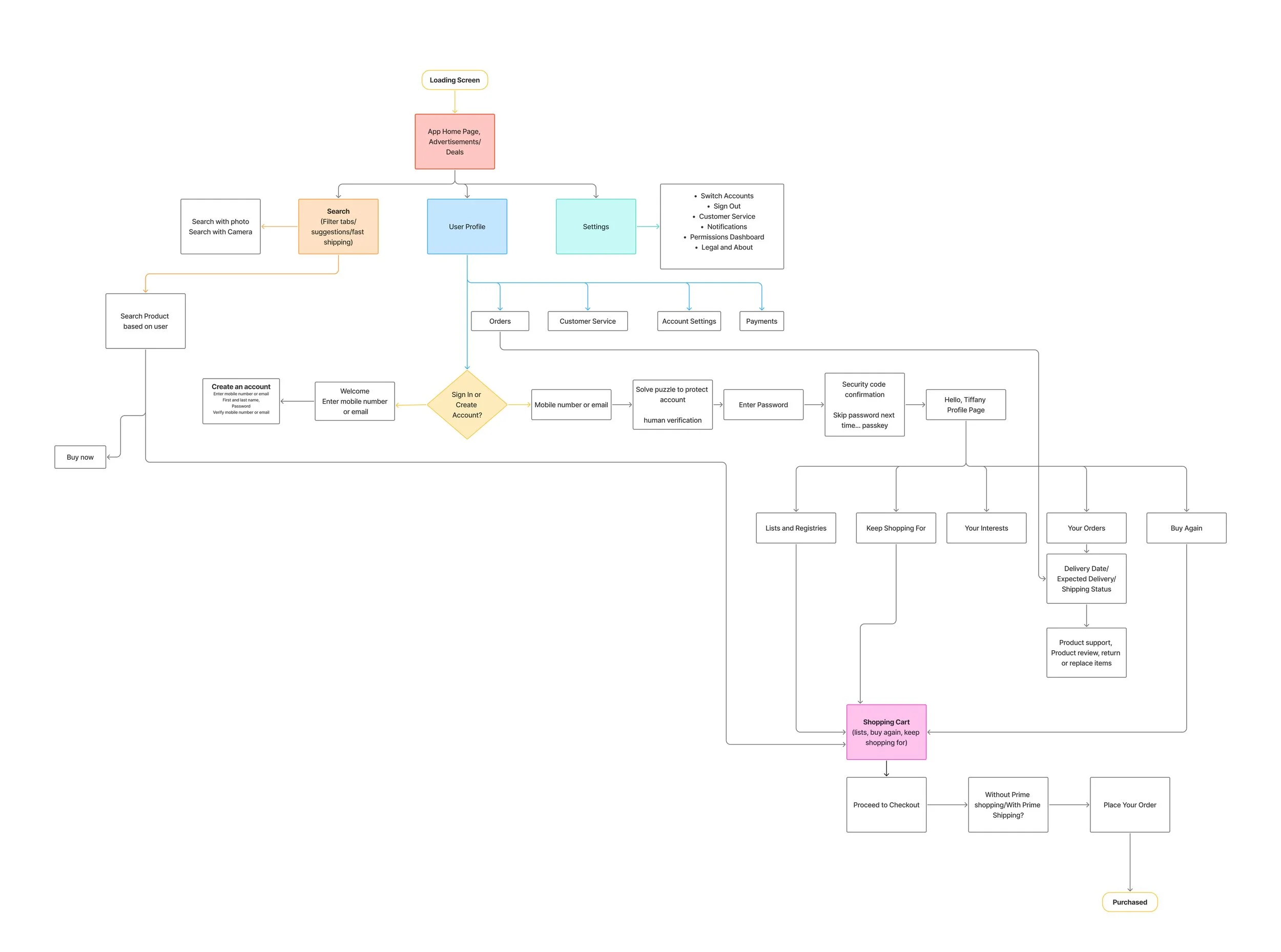
We created a user flow map of the same retail app used in our competitive analysis to better understand its navigation, structure, and decision-making paths.
Mapping the competitor’s flow helped identify key strengths, such as multiple entry points to purchasing and personalized features, as well as pain points including overly complex pathways, redundant steps, and an overwhelming number of options.
These insights informed our design decisions by highlighting the importance of simplifying navigation, reducing friction in key flows, and creating a more streamlined and intuitive user experience.
Phase 2:
Personas, user flow, and low-fidelity wireframe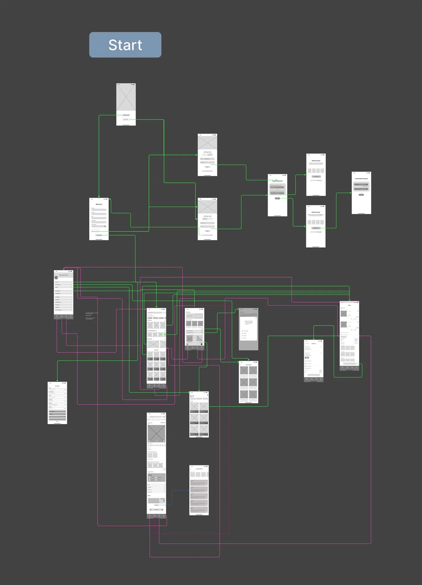

Our user interviews revealed shared frustrations with cluttered interfaces, excessive recommendations, unclear product information, and unreliable reviews. These findings guided us to prioritize simple navigation, clean layouts, clear product details, and trustworthy ratings. By reducing visual overload and making essential information easier to find, Myrae helps users shop with greater confidence.
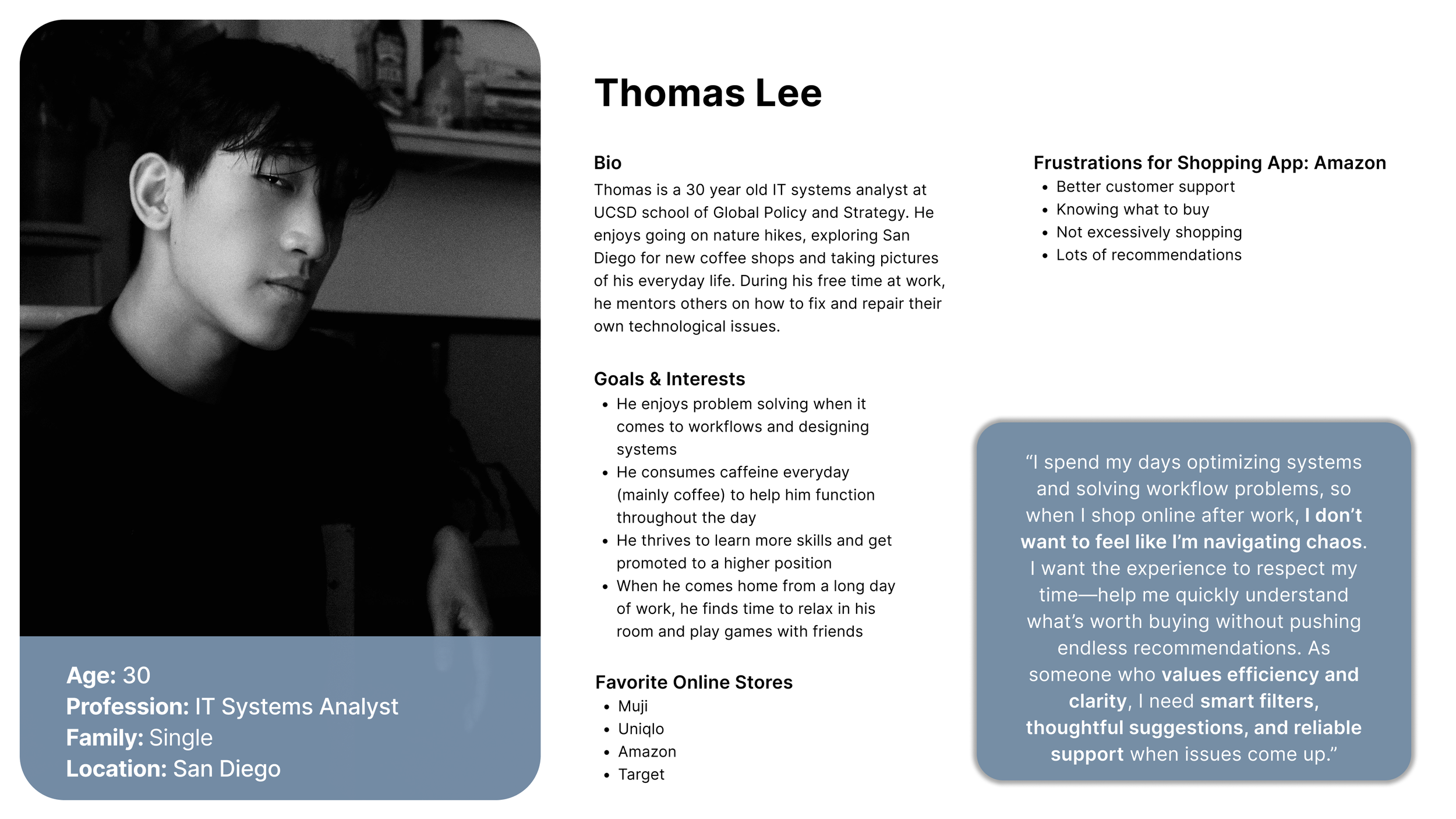
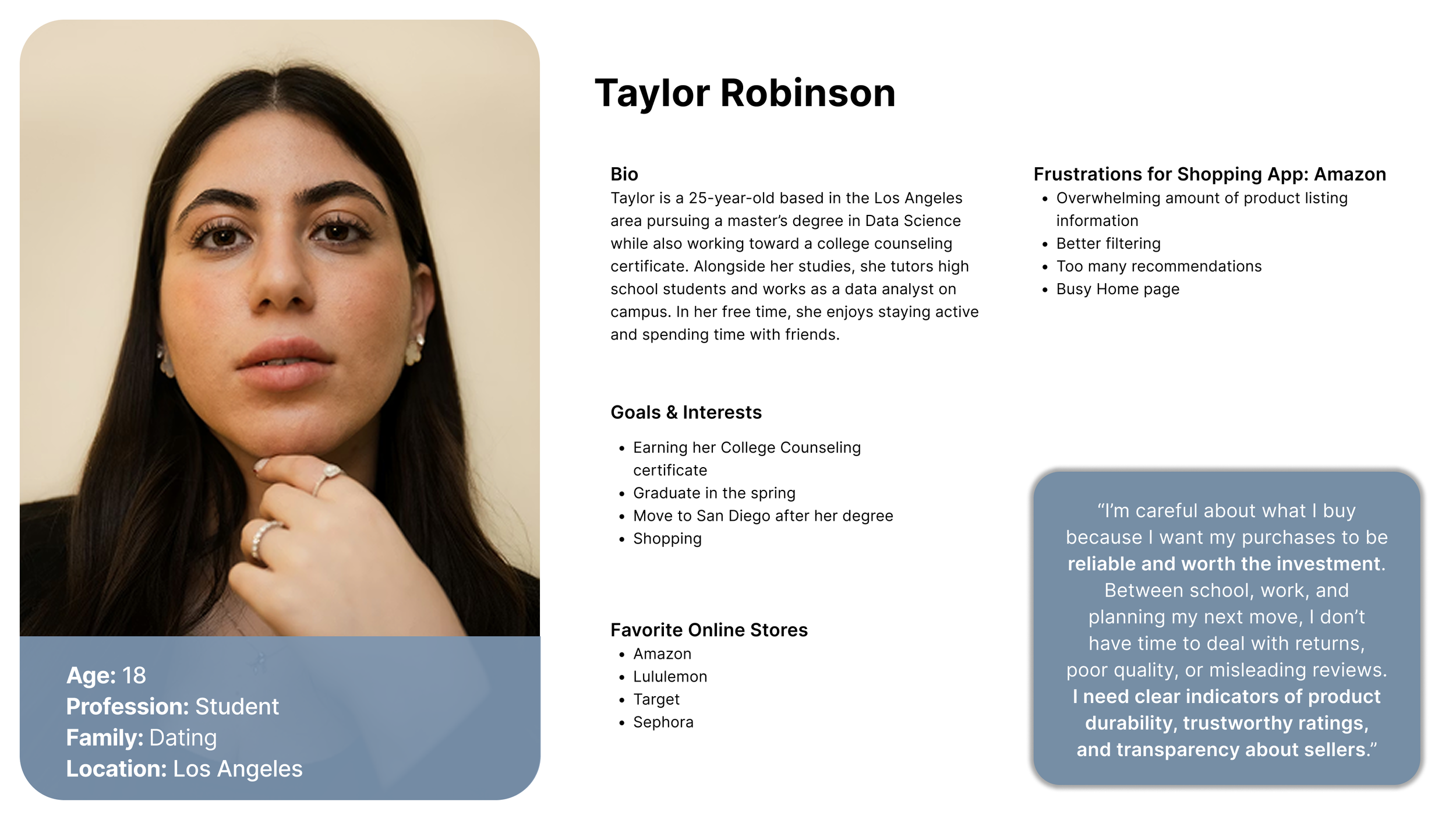
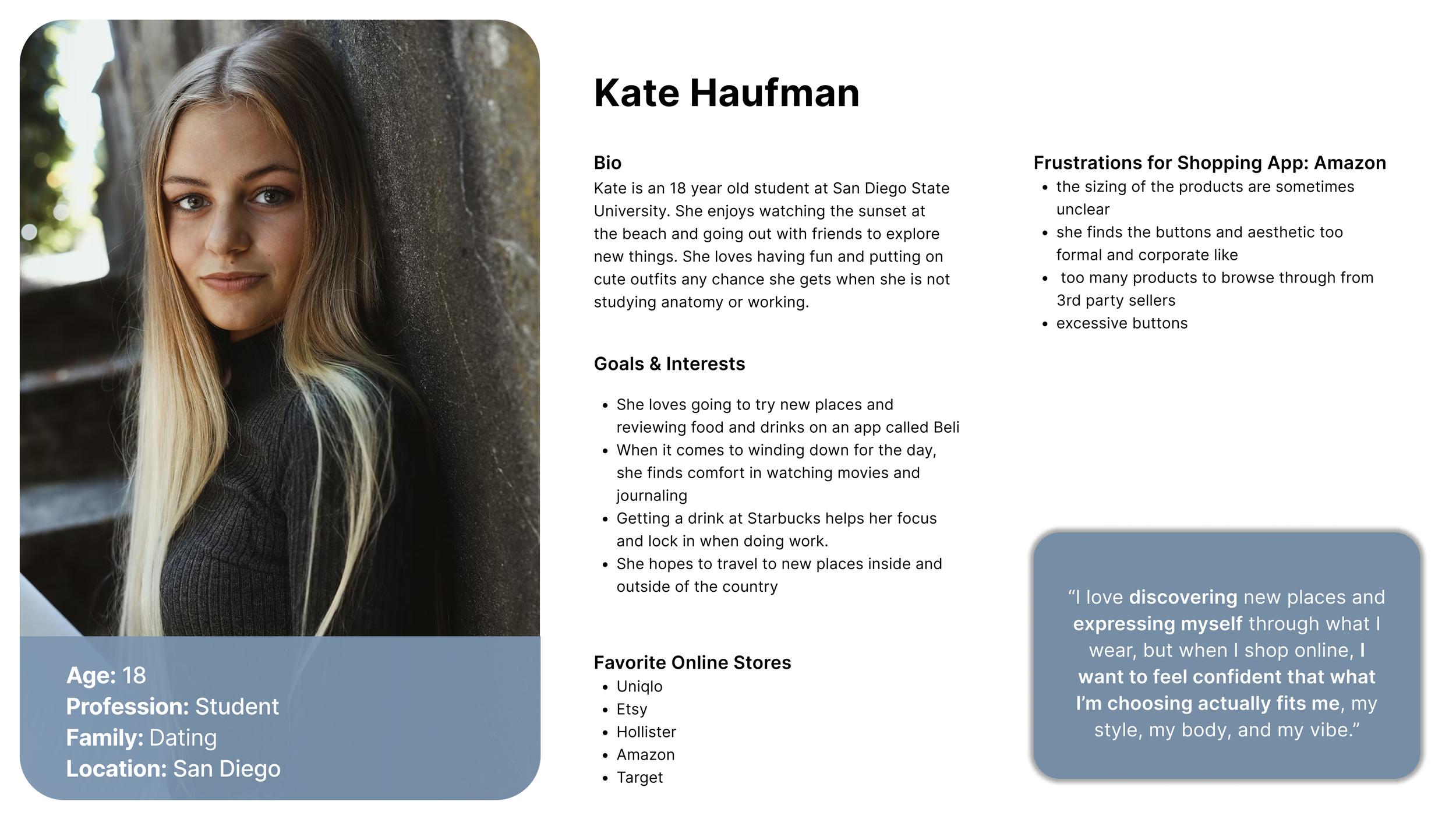
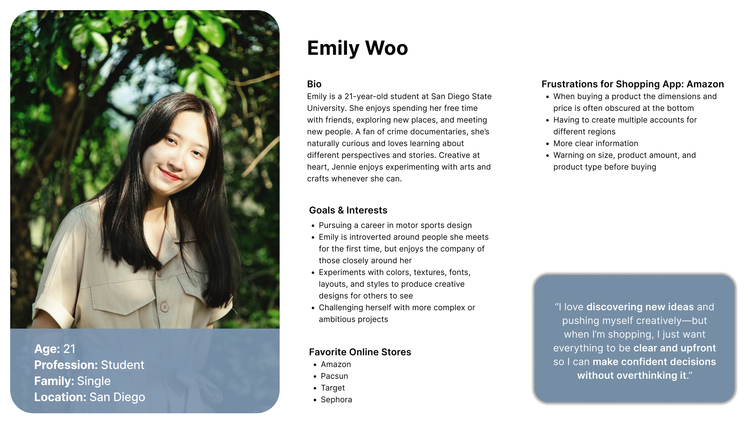
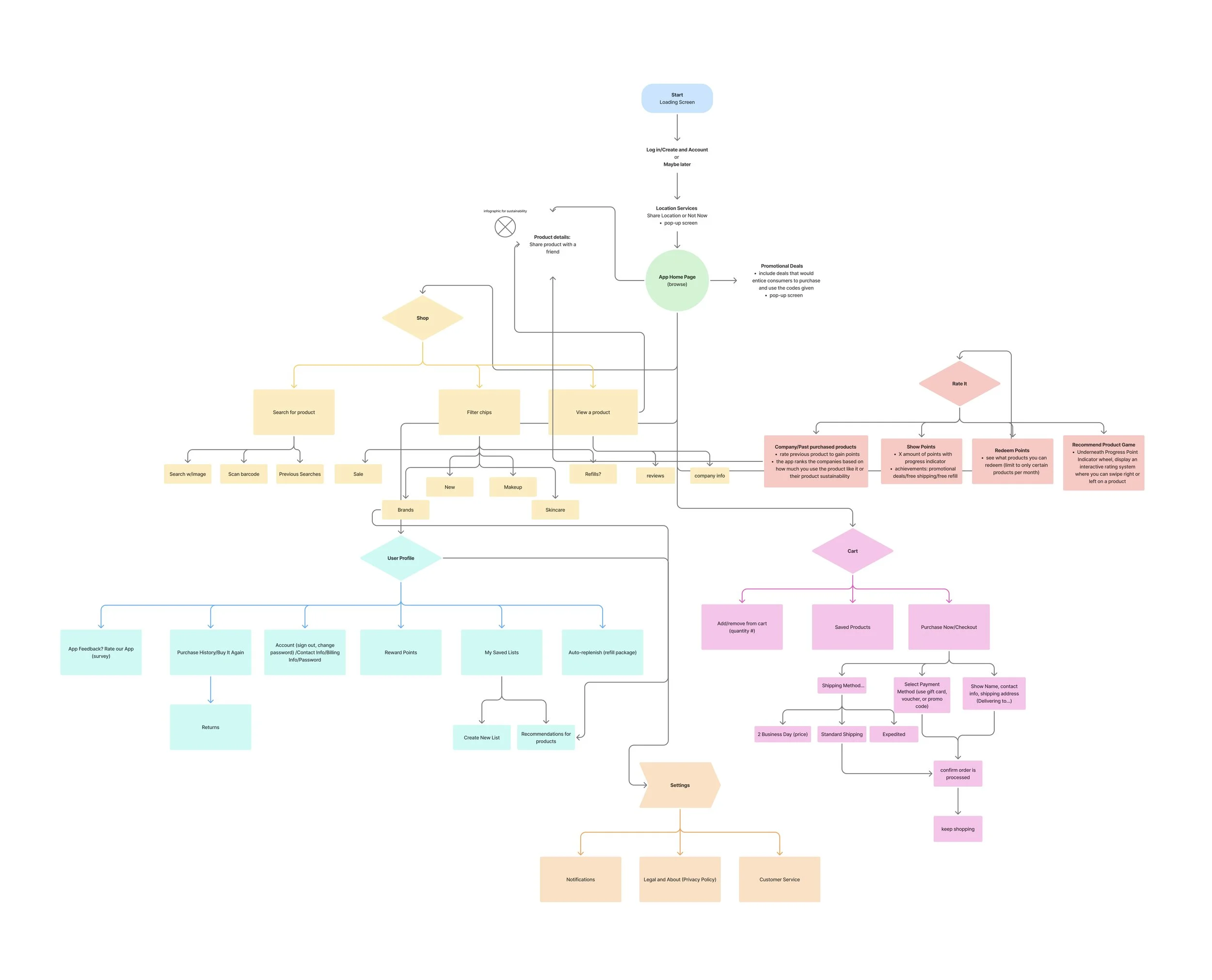
These findings guided our user flow map by helping us prioritize direct and easy-to-follow paths through the app. Because users felt overwhelmed by clutter, excessive recommendations, and unclear product information, we organized the flow around essential actions such as browsing, filtering, viewing product details, reading verified reviews, and completing a purchase. This helped us reduce unnecessary steps and create a more focused shopping experience.
Phase 3:
Build prototype, user testing, data analysis, wireframe refinementsPrototype tests
-
The first round of user testing showed that participants found the app intuitive and easy to navigate, especially when browsing products and viewing product details. Users responded positively to the rating feature and clear product information, which helped build trust and support decision-making. However, feedback identified areas for improvement in the add-to-cart experience, checkout flow, and rating flow, where users noted moments of confusion, unnecessary steps, or lack of visibility. These insights guided refinements to simplify key actions, reduce friction, and improve overall usability.
-
Based on user feedback, data analysis revealed opportunities to improve clarity, reduce friction, and strengthen key features within the app. Updates focused on enhancing the rating feature by increasing visibility and adding incentives to encourage user participation. Improvements were also made to the add-to-cart and checkout flows to streamline interactions and eliminate unnecessary steps. Additionally, the information hierarchy was refined to better highlight important product details and ingredient transparency. These updates aimed to create a more intuitive, efficient, and engaging user experience.
Phase 4:
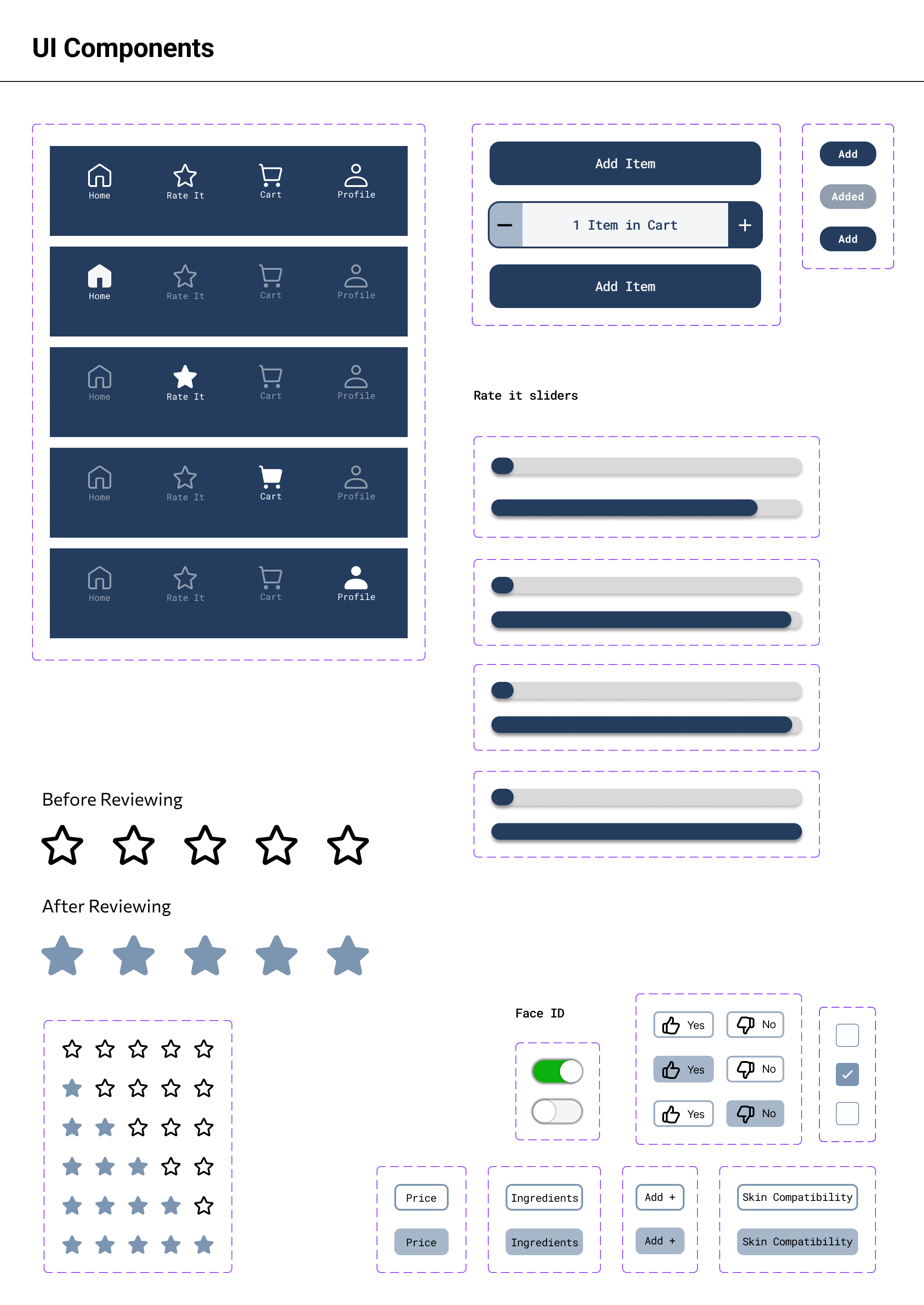
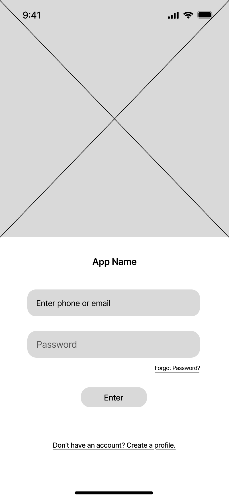
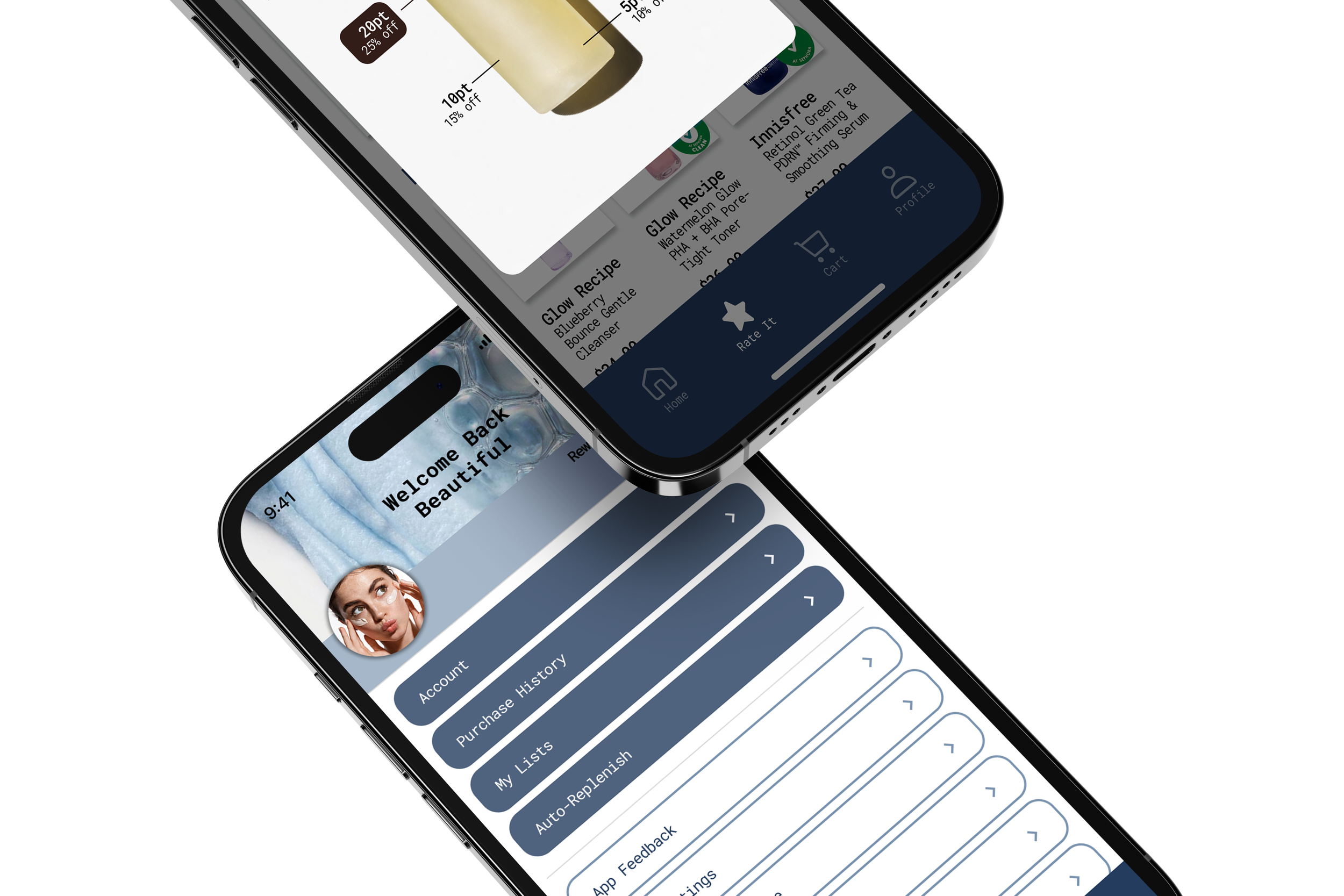
Moodboard, design systems, high-fidelity wireframe, full prototype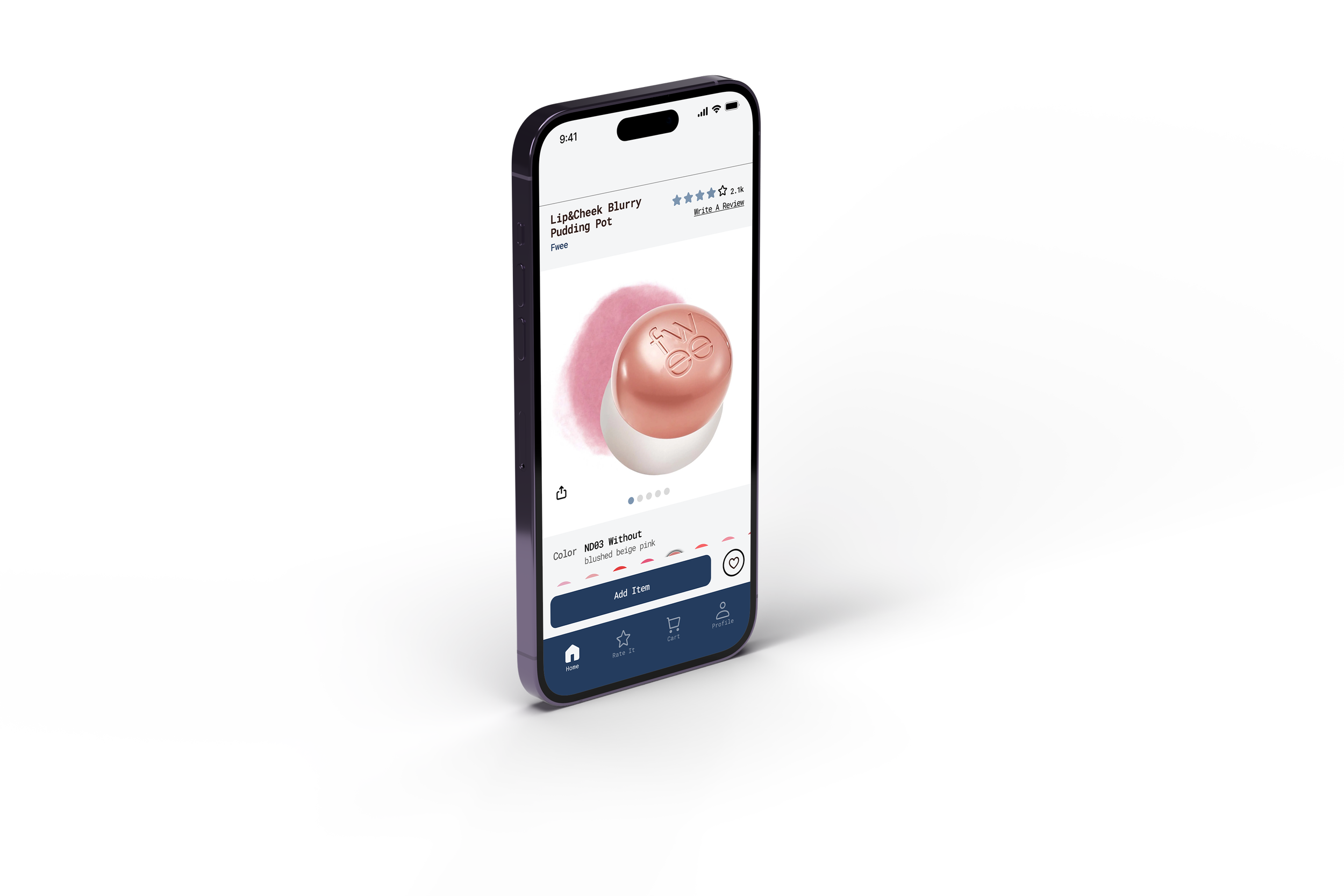


Phase 5:
Final user test, data analysis, final UI refinementsFinal Refinements
-
User testing feedback showed that participants found the app intuitive, visually clean, and easy to navigate, particularly appreciating the organized layout, ingredient transparency, and clear display of ratings and reviews. The “Rate It” feature was well received, with users expressing a higher likelihood of engagement when incentives were clearly communicated.
However, several improvements were identified. Users suggested increasing the visibility of rewards by adding clearer prompts or pop-ups after purchase, as well as consistently displaying point totals within the interface. Some participants experienced minor friction in the product selection flow, noting that too many steps or unclear entry points could slow decision-making. The checkout process was generally smooth, but users recommended improving readability and hierarchy, such as making key actions (like confirming purchases or leaving reviews) more prominent and easier to access.
Additional feedback emphasized simplifying navigation by reducing unnecessary steps, clarifying where to leave reviews, and ensuring that important information such as incentives, ratings, and product benefits are surfaced more clearly. These insights guided refinements aimed at improving usability, encouraging user engagement, and strengthening trust within the overall experience.
-
Data analysis revealed that users needed clearer guidance, stronger incentives, and more accessible language to fully engage with key features. Feedback showed that users were unsure how the rating system worked, did not immediately understand reward opportunities, and found some sustainability labels too technical or unclear.
Additionally, users expressed the need for more transparency around who can leave reviews and when, highlighting the importance of trust in the rating system. The analysis also identified an opportunity to better connect post-purchase moments with engagement features, such as encouraging users to leave reviews through clearer reward messaging.
These insights informed design updates focused on improving clarity, simplifying language, and increasing visibility of incentives to drive user participation and confidence.
-
UI refinements focused on improving clarity, trust, and user engagement across key features. Updates to the “Rate It” page emphasized that reviews are limited to verified purchasers, reinforcing credibility, and added explanatory context to help users better understand the rating system. Sustainability rating labels were revised to be more user-friendly and accessible, ensuring they align with how customers interpret product benefits.
Additional improvements were made to the comments and reviews experience by maintaining consistent, customer-centered language. In the checkout confirmation flow, messaging was enhanced to clearly communicate rewards and incentivize participation in the rating feature, encouraging continued engagement after purchase. These refinements aimed to create a more intuitive, transparent, and motivating user experience.
Designing Myrae showed me that an effective retail experience is not only visually appealing, it must also reduce confusion, build trust, and help users make informed decisions. Our findings reinforced the importance of clear navigation, accessible product information, and simple user flows that support people with different needs and shopping habits. These lessons apply to real-world design because thoughtful, research-driven decisions can make digital experiences easier, more inclusive, and more reliable for everyone.